WOO PERFORMANCE
WooCommerce Performance Optimization Service
Boost Your WooCommerce Store Performance – Faster Speeds, More Sales
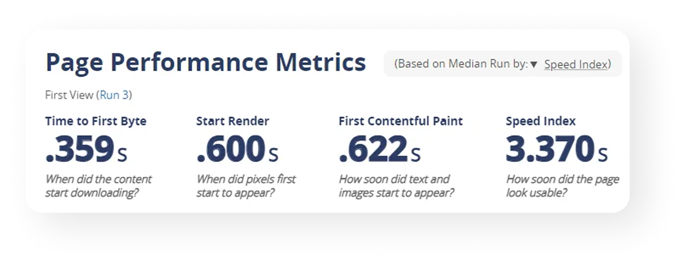
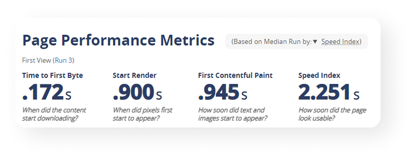
Struggling with slow load times and high bounce rates? Blaze Commerce’s WooCommerce Performance Optimization Service will supercharge your store’s speed, scalability, and user experience. Let us help you unlock higher conversions, reduce customer frustration, and stay ahead of the competition—all without needing to overhaul your existing WooCommerce setup.
What’s Slowing Down Your WooCommerce Store?
Common WooCommerce Challenges and How We Solve Them. Running a WooCommerce store can be challenging when it’s plagued by performance issues. You may be dealing with:
These issues cost you revenue, damage customer trust, and keep your store from growing to its full potential. Blaze Commerce can fix these problems. We don’t just tweak a few settings—we provide a deep optimization of your WooCommerce store that enhances every aspect of its performance.
Why Choose Blaze Commerce for Your WooCommerce Optimization?
Blaze Commerce: Your Partner for WooCommerce Success
Success Stories: WooCommerce Performance Transformed
Real Results from Our Clients
Our clients have experienced firsthand the difference Blaze Commerce makes:

Truckers Toy Store boosted their mobile conversion rate significantly after optimizing for speed and mobile usability, resulting in more sales and a smoother checkout process.
Learn more about their success →

Success Stories: WooCommerce Performance Transformed
Our clients have experienced firsthand the difference Blaze Commerce makes:
Can You Afford to Let Performance Issues Hold You Back?
Every Second Costs You Sales
Blaze Commerce’s Performance Optimization Service doesn’t just solve these problems—we eliminate them, allowing you to focus on what really matters: growing your business.
How We Optimize Your WooCommerce Store
A Step-by-Step Performance Optimization Process. Blaze Commerce makes optimizing your WooCommerce store straightforward and effective:
- Step 1: Site Audit – We dive into your current performance, identifying specific bottlenecks and opportunities for improvement.
- Step 2: Custom Optimization Plan – We craft a personalized plan targeting your store’s unique challenges.
- Step 3: Implementation – Our team makes the changes necessary to supercharge your store’s speed and stability.
- Step 4: Monitoring and Support – We don’t just leave you hanging. We provide ongoing monitoring to maintain peak performance and ensure long-term success.
Want to Learn More?
WooCommerce Performance Resources
Not sure if you’re ready for a full optimization? That’s okay—we’re here to help you learn more.
- Download our Quick-Start Performance Optimization Guide to see how you can begin improving your store today.
- Read our blog post: “Top Tips to Speed Up Your WooCommerce Store Today” for actionable advice you can put to use immediately.
What Our Clients Are Saying
Testimonials from Our Customers
What Our Clients Are Saying
💬 Testimonials from Our Customers
“We saw an almost immediate reduction in bounce rates after Blaze Commerce optimized our store’s performance. It’s been a game-changer for our business.”
“Our store was constantly struggling during peak hours. Blaze Commerce made our WooCommerce site fast and stable, and now we confidently handle all the traffic we get—without worrying about downtime.”
Ready to Boost Your WooCommerce Store?
🔥 Get Started with Blaze Commerce’s Performance Optimization Service
Don’t let a sluggish site hold you back. Blaze Commerce is ready to help you unlock the full potential of your WooCommerce store with our tailored performance optimization services. Boost your speed, scalability, and user satisfaction today.


