If you think trust is a checkout problem, you’ve already lost the sale.
Most store owners I’m talking to right now are dealing with the same thing. Sales are harder to come by than they were 18 months ago. Google’s rewriting what search results look like, AI is changing how shoppers find and evaluate products, and buyers are more cautious with their money than they’ve been in years.
There’s not a lot you can do about any of that directly. What you can do is make sure that when a visitor does land on your site, you don’t give them a reason to leave. And the single biggest reason they leave isn’t price, or shipping, or product selection. It’s trust.
Trust is the only variable in this equation you still control, and it’s the one most WooCommerce stores are getting wrong.
The TL;DR:
- Checkout is the report card, not the exam. By the time a shopper sees your payment form, the trust decision was already made on the homepage and the product page.
- Baymard’s cart abandonment data shows the top reasons buyers leave – surprise costs (47%), forced account creation (25%), slow delivery (24%), credit card distrust (19%) – are all trust signals the product page failed to send earlier.
- Visual appeal judgments form in 50 milliseconds (Carleton University). One-twentieth of a second decides whether the halo effect works for you or against you.
- Stacking more than three or four trust badge types decreases conversion by 5-8% (CXL). Authentic social proof outperforms generic seals every time.
- The agentic commerce shift makes trust signals on your own site more important, not less. Buyers trust merchant sites three times more than third-party AI agents (Bain).
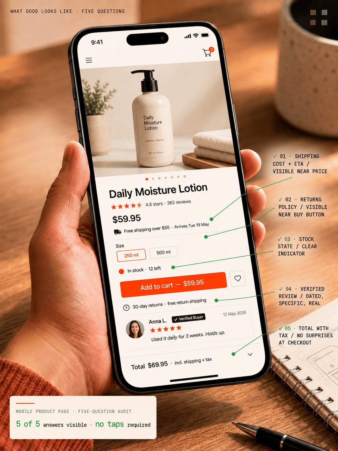
Five questions a first-time buyer should be able to answer on your mobile product page without tapping or scrolling. If they can’t, you’ve got a trust gap – and it’s costing you orders you’ll never see in any analytics report.
Trust isn’t a checkout problem – it’s a page-by-page problem
Here’s the mistake most people make. They think trust is a checkout problem. It isn’t. By the time a shopper is staring at your payment form, the trust decision is already made. It was made on the homepage. Reinforced or undermined on the product page. Tested again at the shipping step. The checkout is where you find out whether the trust you built was real or imagined. It’s the report card, not the exam.
This matters because most conversion advice you’ll read focuses on the wrong place. Optimize the checkout. Reduce form fields. Add a progress bar. Those are real wins, but they’re rearranging the deck chairs. The bigger leak is upstream – the visitor who never reached checkout because the product page didn’t give them enough confidence to add to cart in the first place.
Why customers abandon carts (and it’s not what you think)
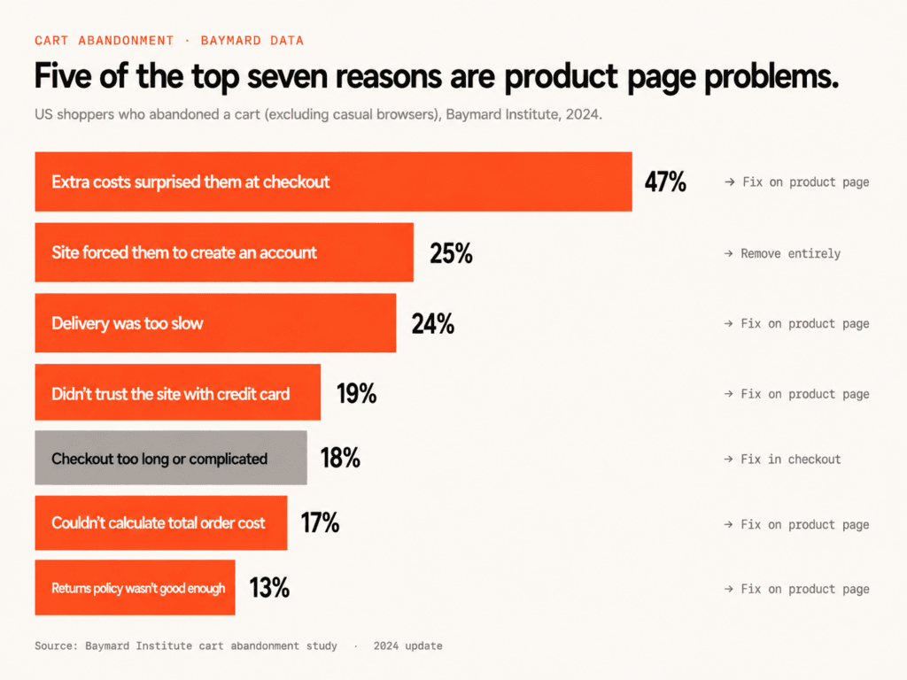
The Baymard Institute publishes what I think is the most reliable data on why people abandon carts. If you exclude the 43% who were browsing, the top reasons US shoppers give for abandoning are:
- 47% – extra costs at checkout surprised them
- 25% – the site made them create an account
- 24% – delivery was too slow
- 19% – didn’t trust the site with their credit card
- 18% – checkout was too long or complicated
- 17% – couldn’t calculate the total order cost upfront
- 13% – returns policy wasn’t good enough
Every single one of those is a trust signal the site failed to send clearly, earlier. Show the shipping cost and free-shipping threshold on the product page and you don’t get the 47%. Put your returns policy near the buy button instead of hidden in a footer link and you don’t get the 13%. Don’t force account creation and you don’t get the 25%.
These are not checkout problems. They’re product page problems. The shopper has questions, and your product page is either answering them or it isn’t.
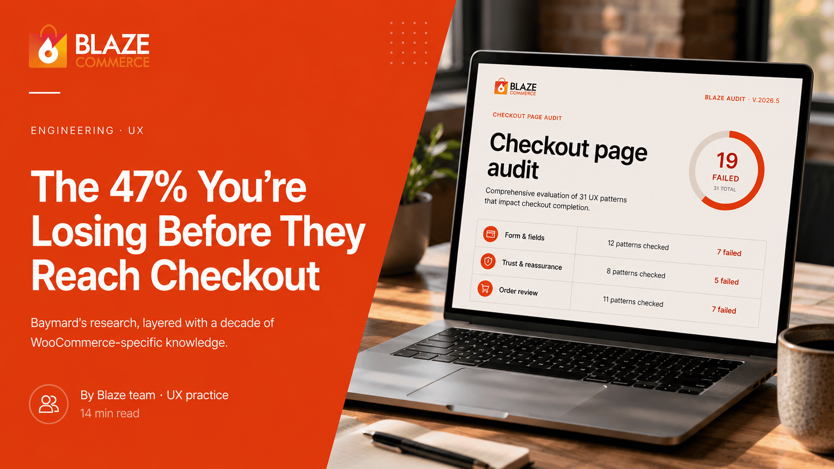
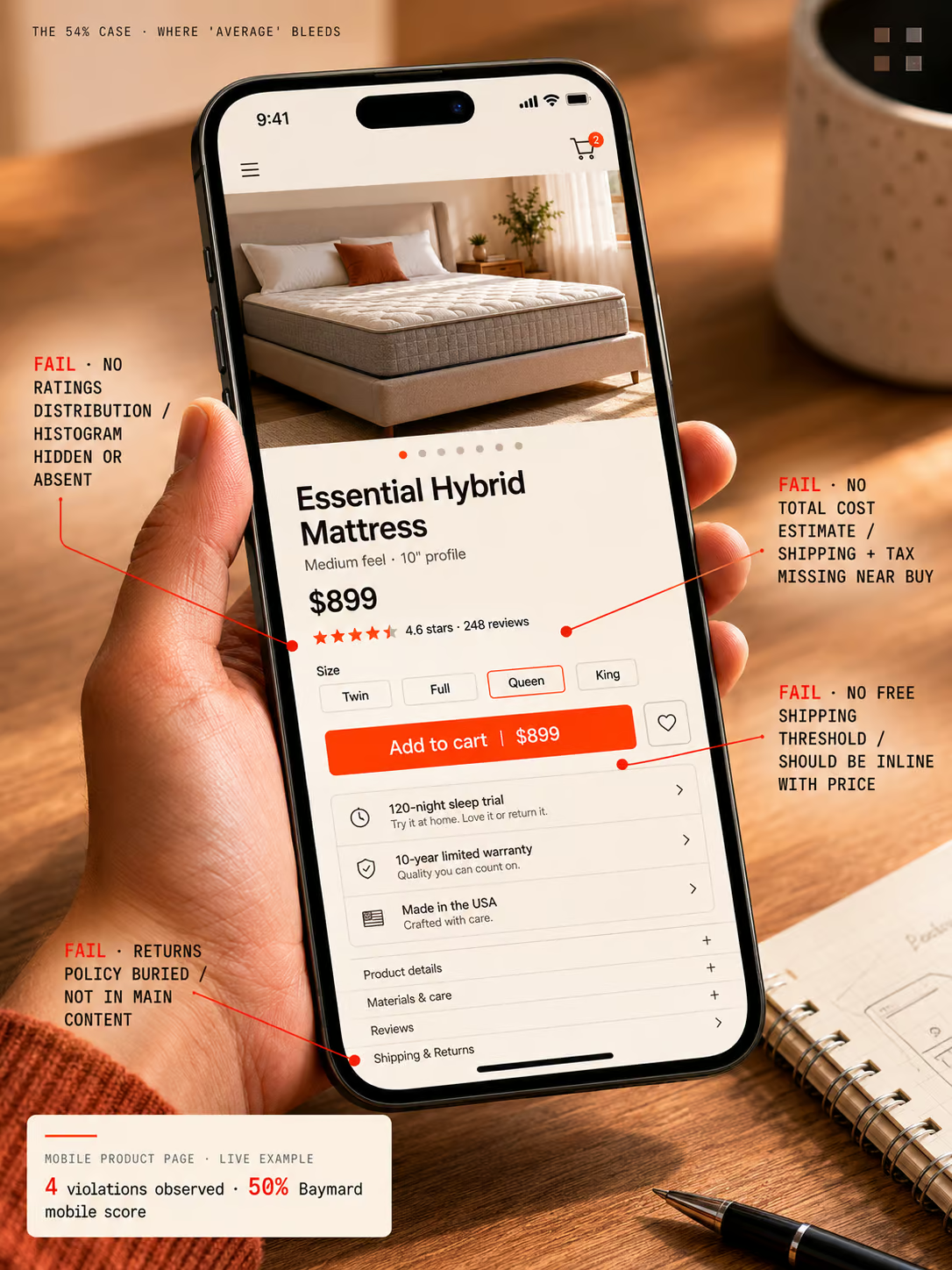
A 54% UX score that’s costing more than the founder realizes
We ran our WooCommerce Revenue Recovery Audit on an organic mattress retailer last month. A store doing meaningful revenue, well-known in their category. The overall score against Baymard’s 245-guideline benchmark came in at 54% on desktop and 50% on mobile. Adequate. The kind of number a founder looks at and thinks fine, we’re average, we’re not bleeding.
But the mobile product page told a different story. Four high-priority violations:
- Return policy not visible in the main content of the page
- Total order cost estimate (shipping, tax) not shown near the buy section
- Free shipping conditions not visible by default
- Ratings distribution not shown at the top of the reviews section
Map those four failures against the Baymard abandonment list. Every one of them is a reason someone on this mattress site was about to bounce – and the retailer had no idea. They weren’t losing orders because of price or product. They were losing them because the page didn’t answer the questions a cautious buyer asks before committing.
This is the trap of “we’re average.” Average means you’re scoring around 50% against a 245-point standard built from 130,000 hours of user testing. Average means you’re sending mixed signals at the exact moment a buyer is deciding whether to give you their credit card. The store doing $200K a month and converting at 1.4% mobile thinks the problem is traffic quality, or seasonality, or the economy. Usually it’s the product page.
Have us audit your store against Baymard’s 245-point standard.
You can keep guessing why visitors aren’t converting. Or we can map your store against the same 245 UX guidelines we ran on the mattress retailer – with the exact violations costing you orders, ranked by priority.
- ✓245-point Baymard UX audit
- ✓Mobile + desktop scored separately
- ✓No contracts, ever
No contracts. See real data from your actual store before any commitment. We’ll show you exactly which trust gaps are leaking revenue – and how to close them.
Where trust gets built or destroyed: three moments
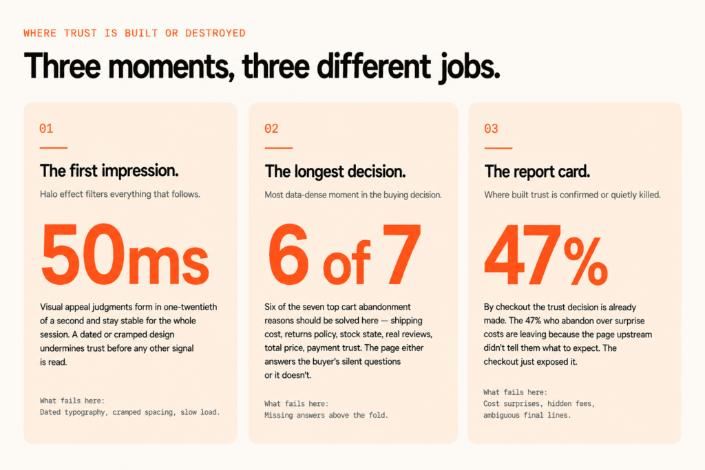
Trust gets built or destroyed in three places on your site.
The first is the moment someone lands. A Carleton University study I keep coming back to found that visual appeal judgments of a web page are formed in 50 milliseconds, and they’re remarkably stable afterwards. Fifty milliseconds. One-twentieth of a second. If your site feels dated or cramped or slow, the halo effect works against you for the entire session. Everything else you do well – the product photography, the copy, the reviews – gets filtered through that initial impression.
The second is the product page, where buyers scan for practical trust signals: clear shipping, clear returns, honest-looking reviews, visible security cues, believable photography. This is the longest and most data-dense moment in the buying decision. Most product pages are designed for someone who has already decided to buy. They need to be designed for someone who hasn’t.
The third is checkout, where every bit of trust you’ve built can be undone by a single ambiguous line about “additional fees calculated later.” If the buyer can’t reconcile the number in front of them with what they expected, the trust collapses. Sometimes silently. They close the tab and you have no idea why.
Why stacking more trust badges makes conversion worse
A lot of stores get trust backwards. They try to fix it by bolting on more signals. Another badge in the footer. A review widget with 47 five-star reviews that all read like the same person wrote them. Stock photos of a “team” on the about page. Research from CXL found that using more than three or four different badge types decreases conversion by 5-8%.
Stacked badges signal desperation, not reliability. Authentic social proof with specific reviews, dates, and real customer photos outperforms generic seals every time.
The difference between a badge and social proof is who’s claiming what. A badge is your store saying “trust us, look, a seal.” Social proof is other customers saying “I bought this, here’s my name, here’s a photo, here’s what it was like.” One is verifiable. The other is decoration. Buyers know which is which, even when they couldn’t articulate it.
What works on a product page: a small cluster of payment provider logos near the buy button (Visa, Mastercard, Apple Pay, the ones the buyer already trusts), an SSL indicator that the browser shows by default, and reviews that look like a real human wrote them. What hurts: a footer carpet-bombed with seals, generic “satisfaction guaranteed” graphics, and review widgets that all sound the same.
Agentic commerce makes your trust signals more important, not less
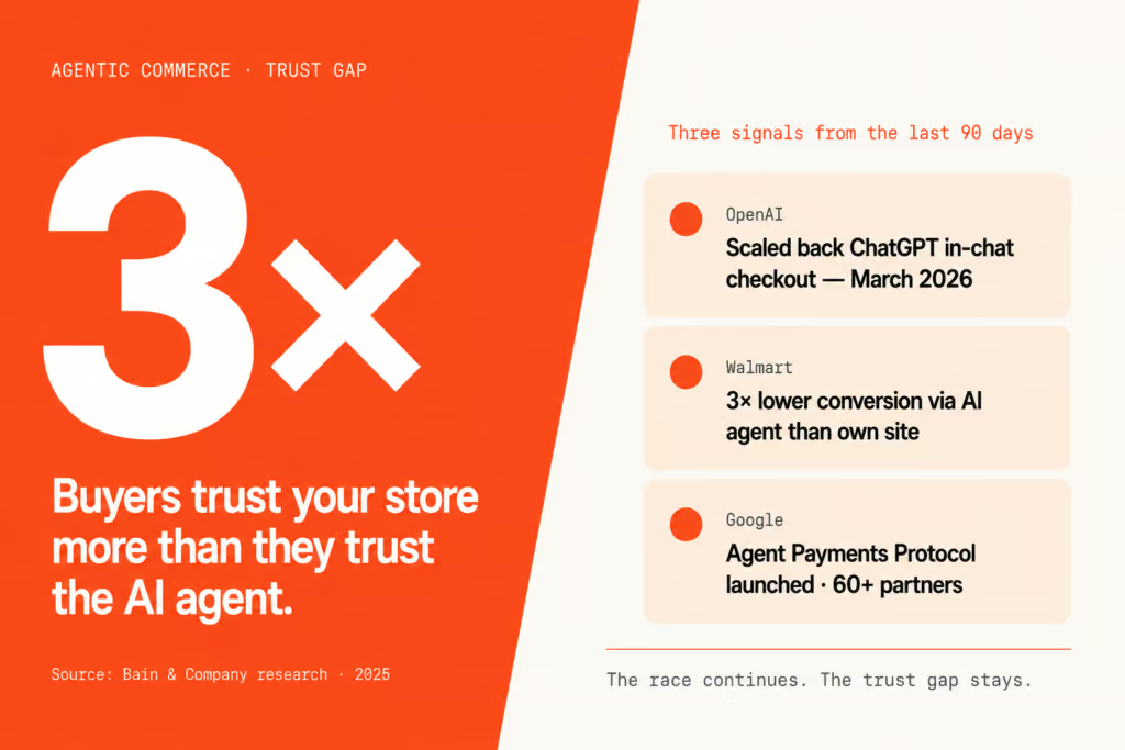
The agentic commerce shift makes this more important, not less. OpenAI scaled back ChatGPT’s in-chat checkout in March after Walmart reported conversion rates three times lower than on its own website, and Bain research showed consumers trust retailers’ own sites three times more than third-party AI agents.
The race continues – Google’s Agent Payments Protocol launched with 60+ partners including Mastercard, PayPal, and Shopify – but the first real attempt at AI-owned checkout failed on the one thing no protocol can engineer: trust. Buyers kept coming back to merchant storefronts to finish the purchase. Which means the trust signals on your site matter more now, not less.
The agent might discover your product. It might add it to a cart. But the conversion happens on your store. The buyer hands over their card number on your domain. The trust signals they see in that moment are the ones you control. If they don’t see what they need, the agent didn’t lose the sale – you did.
What to do this week: the five-question mobile product page audit
Open your most important product page on your phone. Not desktop. Mobile. And check whether a first-time buyer could answer each of these without scrolling or tapping:
- How much will shipping cost, and when will it arrive?
- What is the returns policy?
- Is this product in stock in the size or variant I want?
- What do verified buyers say, and how many of them are there?
- What’s the total price, including tax?
If any of those answers require a tap or a scroll, you’ve got a trust gap. And the visitors you think are browsing? Some of them aren’t. They’re making a decision in the first few seconds about whether you’re worth trusting. Make it easy for them to say yes.
Five questions. One mobile session. Ten minutes of your week. That’s it. The stores that consistently outperform their category aren’t the ones with the best products or the cheapest prices – they’re the ones where these five answers are sitting in plain sight before the buyer has to look for them.
Want the full 245-point audit and the fixes?
We’ll run the full WooCommerce Revenue Recovery Audit on your store – UX, performance, AI readiness, competitor benchmarking. You get a prioritized list of the trust gaps costing you orders, with the exact fixes ranked by revenue impact.
Start My Audit →No contracts. We’ll audit what you have, surface what’s broken, and show you what to fix first. You decide what to do with it.
Frequently asked questions
What is the biggest reason shoppers abandon carts on WooCommerce stores?
Unexpected costs at checkout. Baymard’s data shows 47% of US shoppers (excluding casual browsers) abandon because extra costs surprised them – shipping, taxes, or fees they didn’t see coming on the product page. Make shipping cost, free-shipping thresholds, and tax estimates visible above the buy button and that 47% drops significantly. The fix isn’t in the checkout. The fix is on the product page.
Where should I put my returns policy on a product page?
In the main content area near the buy section, not hidden in a footer link. Baymard ranks returns policy clarity as the 7th most common reason for cart abandonment at 13%. A plain-language summary with a link to the full policy outperforms either burying it or leaving it off the page entirely. Cautious buyers check returns before they commit, and if they can’t find it quickly they bounce.
Do trust badges increase conversion rates?
A small number of well-chosen ones do. CXL research shows that using more than three or four different badge types decreases conversion by 5-8%. Stacked badges read as desperation, not reliability. Payment provider logos (Visa, Mastercard, Apple Pay) and an SSL indicator near the buy button work. Generic “satisfaction guaranteed” seals stacked in the footer don’t. This is one of the trust gaps the audit flags first.
How fast do shoppers form a first impression of my site?
50 milliseconds. A Carleton University study found that visual appeal judgments of a web page form in 50ms and stay remarkably stable afterward. That first impression triggers a halo effect for the entire session, which is why a dated or cluttered design undermines trust even if every other element on the page is sound.
Should I force account creation at checkout?
No. 25% of US cart abandonments happen because the site forced account creation. Always offer guest checkout as the primary path. You can prompt the buyer to save their details after the order completes, when the trust decision has already gone in your favor. Forcing it before the sale is a textbook way to lose the sale.
What is the Baymard 245-guideline benchmark?
An evidence-based ecommerce UX standard built from 130,000+ hours of user testing across hundreds of major retailers. The 245 guidelines cover homepage, product listing, product detail, cart, checkout, account, and mobile-specific UX. Stores are scored against the guidelines and a percentage is calculated. Most WooCommerce stores fall in the 45-60% range. A 54% score is “adequate” but typically masks 4-6 high-priority violations costing real revenue.
Is AI shopping going to replace my product pages?
Not in the near term. OpenAI scaled back ChatGPT’s in-chat checkout in March after Walmart reported conversion rates three times lower than on its own website. Bain research shows consumers trust merchant sites three times more than third-party AI agents. Even with Google’s Agent Payments Protocol now live with 60+ partners, buyers keep coming back to merchant storefronts to complete the purchase. Your product page matters more now, not less.
How do I know if my product page has a trust gap?
Open the page on your phone (not desktop). Without scrolling or tapping, can a first-time buyer answer: shipping cost and arrival date, returns policy, stock availability, what verified buyers say, total price including tax? Every question that requires a tap or scroll is a trust gap. Five questions, one mobile session, ten minutes – that’s the audit.
What’s the difference between social proof and trust badges?
Trust badges are static seals – SSL, payment processor logos, “money-back guarantee” graphics. Social proof is evidence other real customers have bought and been happy – specific reviews with dates, photos, names, and quantities. Social proof outperforms badges because it’s harder to fake and easier to verify. A buyer can see another buyer in a review photo. They can’t see who issued a seal.
Why is mobile trust more important than desktop trust?
70-80% of WooCommerce store traffic is mobile, and mobile typically converts at roughly half the rate of desktop. Most stores audit their desktop product page and assume mobile follows. It doesn’t. Mobile collapses information into accordions, hides shipping policies behind taps, and breaks reviews layouts. The mobile product page is where most trust gaps live – and where most of the revenue is lost.
Accessibility note
The charts and annotated product-page screenshots in this article carry full text descriptions in their alt attributes, so the data and the flagged UX violations are available to screen-reader users and assistive technology. The key figures in plain text: 47% of US shoppers abandon over surprise costs, 25% over forced account creation, 24% over slow delivery, 19% over credit-card distrust, 13% over a weak returns policy (Baymard). Stacking more than three or four trust badge types lowers conversion by 5-8% (CXL). Visual-appeal judgments form in 50 milliseconds (Carleton University). Buyers trust merchant sites three times more than third-party AI agents (Bain). If any part of this page is hard to access, email hello@blazecommerce.io and we’ll provide the content in another format.
Trust is the one variable you still control. Use it.
You can’t change Google’s search results. You can’t control how AI agents rank products. You can’t fix the macro economy or convince cautious buyers to be less cautious. Those are weather. You don’t argue with weather.
What you can do is make sure that when a buyer lands on your product page – whether they got there from Google, ChatGPT, an Instagram ad, or a friend’s recommendation – the first five seconds give them every reason to stay and zero reasons to leave. Shipping visible. Returns visible. Stock visible. Reviews visible. Total price visible. Five answers, sitting in plain sight, in the order a cautious buyer asks them.
That’s the work. Not another badge in the footer. Not a longer checkout flow with more upsells. Just answer the questions the buyer is silently asking, before they have to ask them.
Get my free trust-gap audit
We’ll score your store against Baymard’s 245-point UX standard, surface the high-priority trust gaps on your mobile product page, and send the findings within 7 days – with the exact fixes ranked by revenue impact.
Start My Audit →No contracts. See real data from your actual store before any commitment.
Talk directly with Campbell
Founder · 10 years WooCommerce
Book my strategy call
30 minutes with Campbell. We’ll walk through your product page together and identify the trust gaps costing you orders – whether or not you work with us.
Book My Strategy Call →30 minutes. No pitch – an honest assessment.