
Most WooCommerce stores lose customers at the homepage and the main menu, before a single product is viewed.
A shopper lands, can’t tell where to go, and leaves. That is not a traffic problem. It is a user experience (UX) problem, and it is costing you orders every day.
Homepage and navigation are the first points of contact for both high-intent and low-intent shoppers. Get them wrong and you pay for traffic that never converts.
Below are six UX guidelines, drawn from large-scale ecommerce usability research, that decide whether a visitor browses or bounces.
Essential Homepage & Navigation UX Guidelines
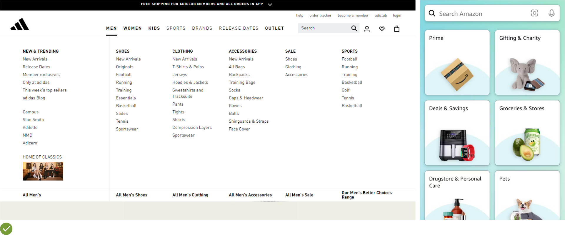
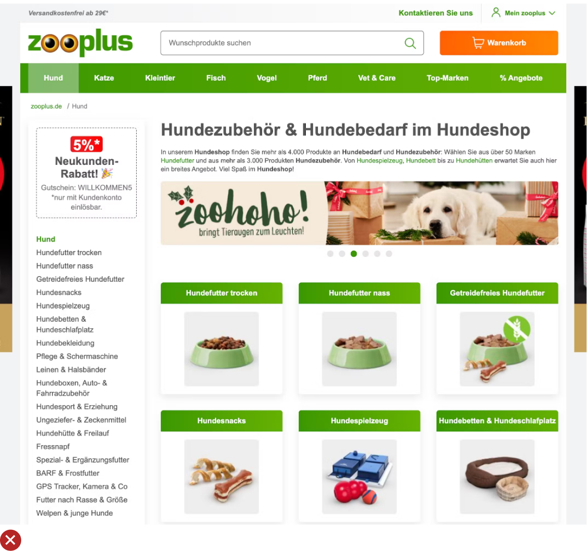
UX Guideline 1. Prioritize Product Categories in Main Navigation
Issue: The usage of a singular main navigation item, such as “Products,” that includes all product categories can cause undue complexity in the top hierarchy and impede product browsing.
Advice: Directly display product categories (e.g., “Men’s”, “Women’s”, “Electronics”) as the top layer of the main navigation. This should be immediately visible on desktop without hovering, and quickly accessible upon opening the main navigation on mobile.
Example: Businesses like Samsonite ensure clear navigation by featuring first-level product categories, such as “Business & Laptop Cases”, prominently in their main navigation.
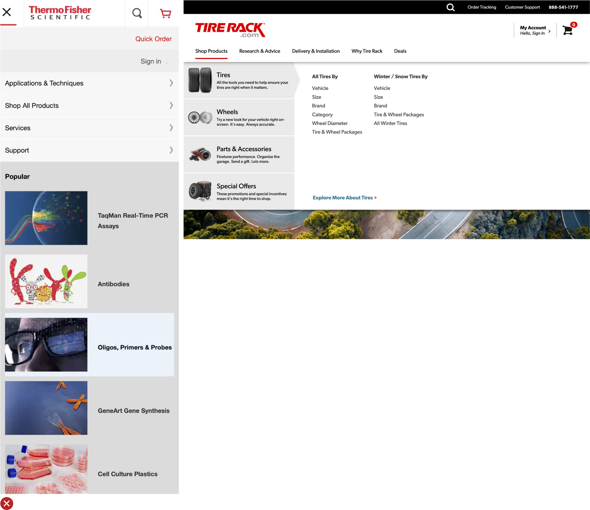
UX Guideline 2. Differentiate Sitewide Courtesy Navigation from Main Product Navigation
Issue: Courtesy navigation can lead to clutter and confusion in the main navigation, inhibiting easy browsing of products.
Advice: Separate the sitewide courtesy navigation visually from the main product navigation and categorize it into thematic sections. Commonly needed options like “Sign In”, “Create Account”, “Help”, “Contact / Customer Service”, “Store Locator”, and “Track an Order” should be included in the courtesy navigation.
Example: Northern Tool excels at grouping related courtesy navigation options, such as customer support phone number and chat, separate from other courtesy options.

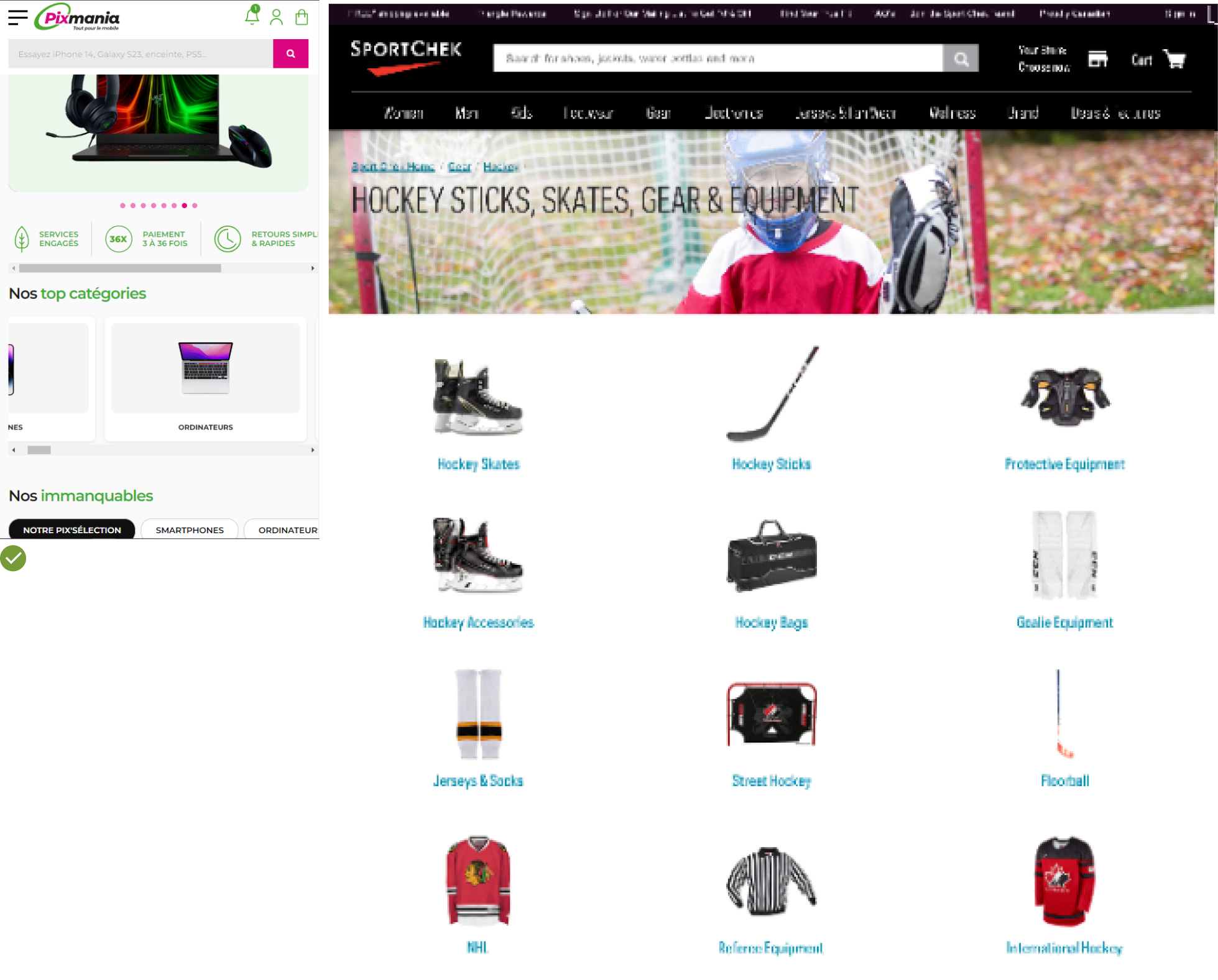
UX Guideline 3. Aid User Selection of a Well-Defined Scope
Issue: When the homepage doesn’t help users define their scope, they have to dig through the site’s category taxonomy, which leads to inefficient and roundabout navigation.
Advice: Aid users in making well-defined scope selections right from the homepage. Promote popular categories and sub-categories, or use wizards to guide shoppers to a scope.
Example: Pixmania efficiently promotes popular categories and sub-categories directly on their homepage, enabling users to swiftly enter the “Digital Cameras” sub-category.

UX Guideline 4. Display Clear, Representative Subcategory Thumbnails
Issue: Text-only links can be challenging to scan and provide limited information. Misinterpretation can occur with some subcategory thumbnails.
Advice: Always include subcategory thumbnails on intermediary category pages on both desktop and mobile platforms. These thumbnails should be clear, representative, and quickly interpretable.
Example: Costco effectively uses subcategory thumbnails on their intermediary category pages to clarify the product type each subcategory contains, either by isolating the product from its typical context or focusing the image to avoid misinterpretation.
UX Guideline 5. Employ Intermediary Category Pages in the Top Levels of Site Taxonomy
Issue: When top hierarchy levels lead directly to product-listing pages, users may struggle to select an appropriate scope, resulting in either excessively broad or overly narrow product lists.
Advice: Implement the first 1-2 levels of your navigation hierarchy as intermediary category pages. A third level can be considered if it offers additional scope definition that benefits the users.
Example: At Macy’s, an intermediary category page under “Men” was introduced to aid users in defining their scope before browsing products, preventing too broad or vague searches.

UX Guideline 6. Utilize Filters for Product Types with Shared Attributes
Issue: Product discovery can be hindered when elements better suited as filters are implemented as categories.
Advice: Use filters for product types, not categories, when most product attributes (e.g., “brand” and “style”) are the same across the product type. Conversely, use categories for product types that don’t share most attributes and are thus mutually exclusive.
Example: HP correctly employs product types and features as filters instead of categories, allowing users to view and compare similar items like “Intel Core i3” and “Intel Core


What Better Homepage and Navigation UX Returns
Homepage and navigation do one job: get the right shopper to the right product in as few steps as possible.
When that path is clear, average order value rises, because shoppers reach more of the categories they came for and discover products next to them.
The six guidelines above are not cosmetic. Each one removes a specific point where shoppers stall, hesitate, or leave. Apply them to your WooCommerce store and you stop paying for traffic that bounces at the front door.
For the full set of homepage, category, and product-page patterns, see our WooCommerce UX guide. For a worked example of UX and performance work on a live store, see the Austin Natural Mattress case study.
Accessibility and Navigation
Clear navigation is also accessible navigation. The same structure that helps a rushed shopper helps someone using a screen reader or keyboard:
- Use real text for menu and category labels, not images of text, so screen readers can announce them.
- Make every menu item reachable and operable by keyboard, with a visible focus state.
- Give category thumbnails descriptive
alttext that names the product type, not a filename. - Keep color contrast for menu and link text at WCAG AA (4.5:1 for body text) so labels stay readable.
- Maintain a logical heading order (one H1, then H2s and H3s in sequence) so assistive tech can build an outline of the page.
Frequently Asked Questions
Why does homepage and navigation UX affect conversion rate?
The homepage and main menu are where most shoppers decide whether to keep going or leave. If they can’t quickly see where to find what they came for, they bounce before viewing a product. Clear product categories, separated courtesy navigation, and guided scope selection move more visitors from browsing into buying.
Should product categories or a single “Products” menu item go in the main navigation?
Show the actual product categories (for example “Men’s”, “Women’s”, “Electronics”) as the top level of the main navigation. Burying every category under one “Products” item adds a step and hides the choices shoppers are looking for. Categories should be visible on desktop without hovering and one tap away on mobile.
When should I use filters instead of categories?
Use filters when products share most attributes (such as brand or style) and shoppers want to compare similar items. Use categories when product types are mutually exclusive and don’t share those attributes. Putting filter-style attributes into the category tree makes products harder to discover.
What are intermediary category pages and why use them?
Intermediary category pages sit at the top one or two levels of your taxonomy and help shoppers narrow their scope before they hit a product-listing page. Without them, top-level links drop users straight into lists that are either too broad or too narrow, which makes the right product harder to find.