Annemarie had turned off all advertising for Byron Bay Candles.
After watching her daily orders drop from 30-40 to barely 10, she made the painful decision: stop paying for traffic to a website that would not convert. With a shipping container of inventory arriving from China and cash flow stretched thin, she could not afford to keep funding clicks that bounced.
This article is part of our WooCommerce Performance Optimisation series. For the complete guide covering why stores are slow and how to resolve it, start there.
The numbers told the story: a -10.4/100 mobile UX score. For a business where 70% of traffic came from smartphones, this was not a minor problem – it was a crisis.
A note before we start: this case study gets into PageSpeed scores, UX failures, and the WooCommerce build underneath them. If that’s your world, the detail is all here. If it isn’t, the short version is simple – we reworked the mobile experience on Byron Bay Candles’ existing store, and mobile average order value rose sharply as customers could finally find and buy the products. Skip to the FAQ for what that means for your store.
Three Years of Treading Water
“I haven’t grown in three years,” Annemarie told us during our first call. While her competitors expanded, she was stuck manufacturing private label candles for other brands – essentially building her competitors’ businesses instead of her own.
The irony wasn’t lost on her. Byron Bay Candles had won Clean + Conscious Awards for their refillable candle system. They’d eliminated 21 million tons of potential landfill waste. Their products used 100% pure essential oils when most manufacturers used synthetic fragrances. The quality was exceptional.
But none of that mattered when customers couldn’t find products on the website.
Previous agencies and developers had taken her money and delivered nothing. No reports. No improvements. No accountability. “I’ve gone down so many different tunnels and paths,” she explained. “I need someone I can trust to make decisions on our behalf.”
When TikTok Ads rejected her campaigns with a blunt “your website is too slow,” she knew something had to change. But after being burned repeatedly, trust was the real barrier – not budget.
What Was Broken
We diagnose every WooCommerce store across four layers, built up over 11 years and hundreds of engagements: UX (how customers find, evaluate, and buy), performance (load, render, and infrastructure), analytics (what the data shows about real customer behaviour), and the WooCommerce build (theme, plugins, and the patterns introducing fragility). No single layer is the whole picture. The value is in integrating all four. On Byron Bay Candles, the findings stacked up across every one of them:
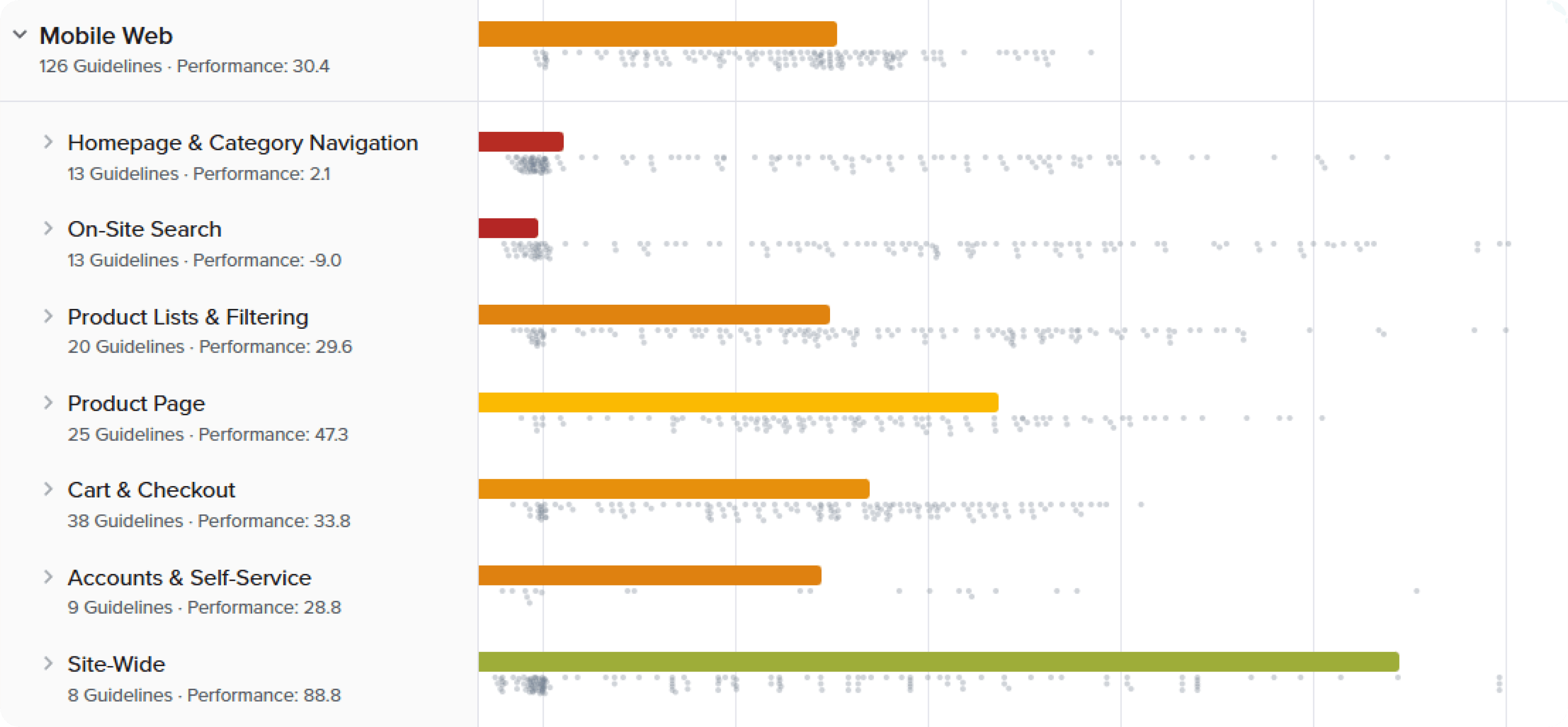
- UX – mobile homepage: The -10.4/100 score meant mobile visitors hit immediate barriers. Headers consumed precious screen space. Navigation mixed product categories with customer service links. The search couldn’t handle typos – costly when, as our review noted, most people misspell.
- UX – category structure: Customers had to navigate overly specific categories instead of browsing full ranges. No filtering by scent families, sizes, or candle types. On mobile, that meant endless scrolling and frustration.
- UX – on-site search: With around 40% of ecommerce users preferring search, Byron Bay Candles was losing potential sales. Search returned limited results, couldn’t handle misspellings, and gave no visual feedback about result counts.
- UX – checkout: Mobile checkout demanded unnecessary fields, lacked progress indicators, and had not been optimised for thumb-friendly interaction. Every additional tap was another chance for abandonment.
- Performance: Page loads were slow enough that TikTok Ads rejected the campaigns outright. For a store where 70% of visitors are on mobile and often on patchy connections, render and load time were gating every other improvement.
- Analytics: Annemarie could see orders falling but not why. The data on how mobile visitors moved through the site – where they dropped, what they searched for, what they never found – was never surfaced in a way she could act on.
- WooCommerce build: A tangle of plugins and an unoptimised theme were adding weight and fragility, and integrations like Craftybase inventory and Klaviyo email flows weren’t tracking correctly.
The UX layer here draws on ecommerce UX research from the Baymard Institute, combined with the pattern recognition we’ve built across hundreds of WooCommerce stores. What made the diagnosis land for Annemarie wasn’t a checklist – it was that we showed her exactly what to change and why. When we sent our initial video review, she implemented several changes immediately, before even hiring us.
“The way you explained analytics,” she said, “I finally understood what was happening.”
Why This Hadn’t Been Solved
Annemarie wasn’t short of effort or willingness to spend. She’d hired agencies and developers before. The problem was that none of them specialised in WooCommerce, and none of them looked at the store as an integrated system. They saw a slow site and tuned a setting, or saw an ugly page and made it prettier. None connected the mobile UX score, the search failures, the checkout friction, and the plugin fragility into one diagnosis.
That’s the gap 11 years and hundreds of WooCommerce engagements close. We knew things her previous developers didn’t: how Craftybase inventory integrates cleanly with a headless frontend, why her Klaviyo flows weren’t tracking, and how the platform’s defaults were quietly capping her conversion. After being burned repeatedly, what Annemarie needed wasn’t another round of promises – it was a partner who would answer the phone, explain things plainly, and own the outcome.
We’ll show you exactly where your store loses revenue.
We audit your store across UX, performance, and conversion, then show you the specific issues costing you orders – each one measured against revenue impact. You get a prioritised list of what’s losing money and what it’s worth to resolve.
- ✓239-point Baymard UX audit
- ✓Core Web Vitals + LCP + CLS benchmark
- ✓SemRush health benchmark
Every finding comes with the revenue it’s costing you and the lift from resolving it. You decide what’s worth doing.
What We Did
We don’t do rebuilds. In 11 years, we’ve never told a client to start over. Byron Bay Candles’ site after we shipped was the same site Annemarie came to us with – same URL, same content, same orders, same customer data. What changed was the theme, the failing mobile UX areas, the search, the checkout, and the performance configuration. Same store, working properly.
Using headless WooCommerce architecture, we separated the shopping experience delivered to the 70% of visitors on mobile from the WordPress backend, while keeping Annemarie’s workflow exactly the same. The work ran across the four layers we’d diagnosed:
Smart category structure: We restructured overly specific categories into logical groups, then added intelligent filtering. Shopping for candles? Filter by scent family (woody, fresh, floral), size (travel, standard, luxury), or purpose (relaxation, energising, ambiance). Each category got filters that mattered to buyers.
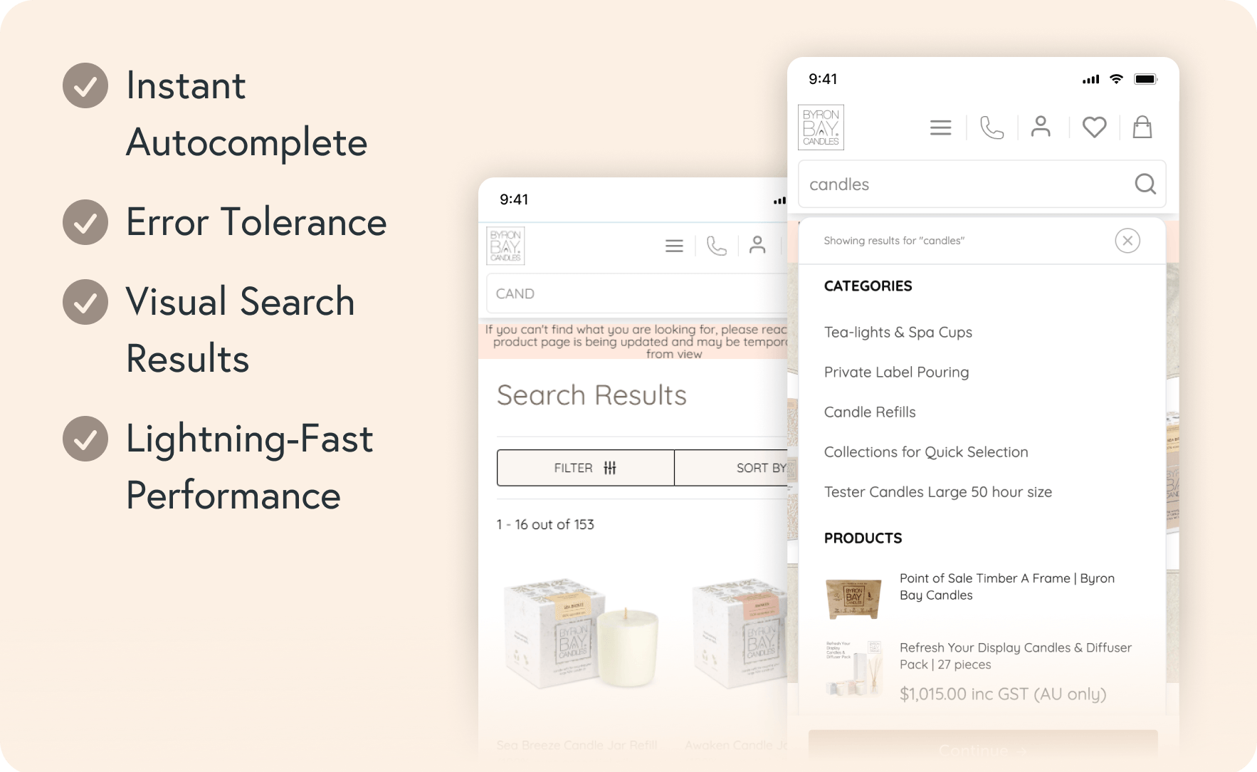
Search that works: Our instant search implementation included:
- Typo tolerance (because “lavendar” should find “lavender”)
- Visual result counts before clicking
- Predictive suggestions as users type
- Fast response even on 3G connections
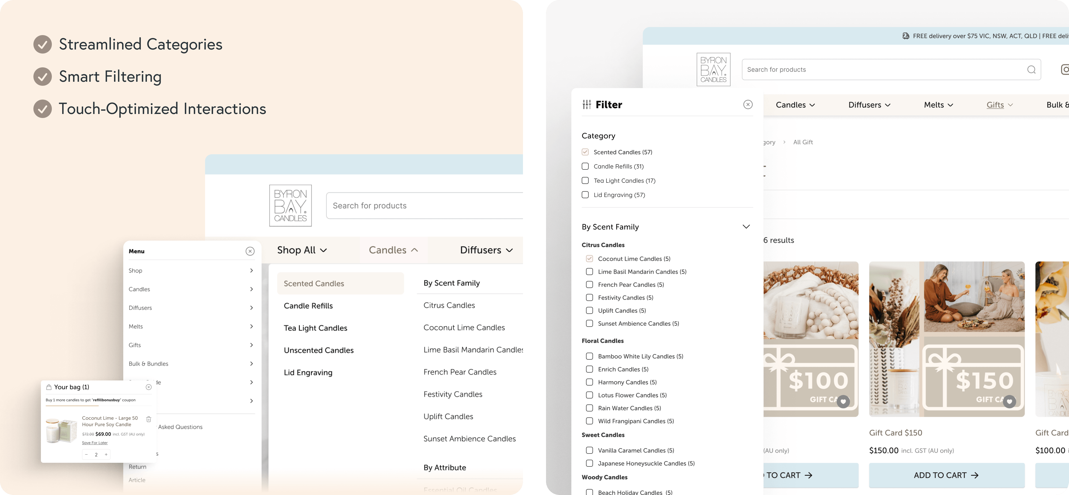
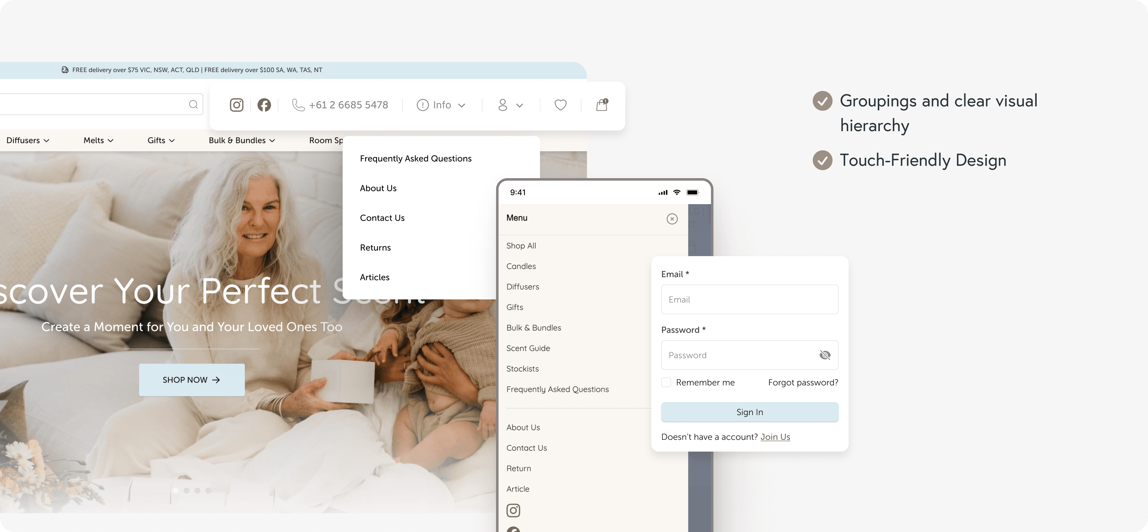
Navigation clarity: We separated product navigation from courtesy links. Product categories stayed prominent and thumb-accessible. Account, contact, and policy links moved to logical secondary positions. No more cognitive overload.
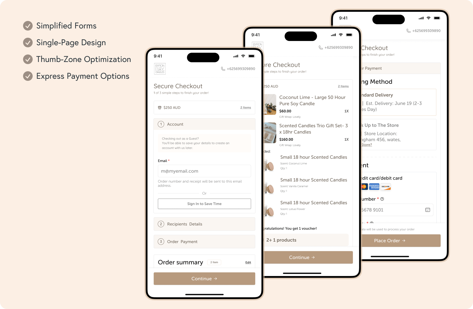
Mobile-first checkout: We removed unnecessary fields, added clear progress indicators, and optimised every element for one-thumb operation. Express payment options for returning customers. Smart address autocomplete to reduce typing.
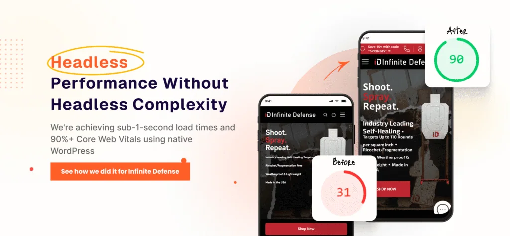
Performance: The technical implementation delivered half-second page loads, with instant page transitions that feel native-app smooth.
The Difference Specialisation Makes
After more than 10 years working exclusively with WooCommerce, we understood the realities of Australian ecommerce that Annemarie’s previous developers didn’t:
- Competing against drop-shippers with unlimited ad budgets
- Managing wholesale and DTC channels from one platform
- Dealing with overseas suppliers and long lead times
- Balancing cash flow between inventory and marketing
Most importantly, we understood that Annemarie didn’t need another agency making promises. She needed partners who would answer the phone, explain things clearly, and work within her reality – including offering a 5-month payment plan when cash flow was tied up in inventory.
Accessibility
A site that works for the 70% on mobile has to work for the people relying on assistive technology too – and on Byron Bay Candles, the two goals reinforced each other. As we reworked the purchase journey, we held it to WCAG 2.1 AA as the baseline:
- Semantic heading and landmark structure, so screen-reader users can move through products, search, and checkout in a logical order
- Colour contrast on text, buttons, and form fields tested against AA thresholds
- Full keyboard operability across navigation, filtering, search, and the checkout flow, with visible focus states
- Labelled form fields and clear, programmatically associated error messaging at checkout
- Thumb-friendly tap targets that also satisfy minimum target-size guidance
The same decisions that make a checkout easy to complete one-handed on a phone – clear labels, generous targets, a logical order, visible state – are the decisions that make it usable with a keyboard or a screen reader. Accessibility wasn’t a separate workstream; it was how the mobile rework was built.
Six Months Later: Stable Foundation, Growing Confidence
The transformation wasn’t only in metrics – it was in capability. Six months after launch, Byron Bay Candles had achieved:
- Mobile Average Order Value: Up 76% – From $71 to $125, mobile visitors now spend nearly as much as desktop users. This single change fundamentally improved the economics of mobile traffic.
- UX Scores: From Red to Green – Every metric moved from “failing” to “good” or “excellent.” The site now provides the premium experience their products deserve.
- Search Success: 40% of Purchases – Customers can finally find what they want, even with imperfect spelling. The new search drives nearly half of all conversions.
- Advertising Resumed – After months of zero ad spend, Annemarie restarted campaigns. With mobile conversion barriers removed, she can invest in traffic with confidence.
- Time Reclaimed – Instead of managing two systems or explaining to customers why the site is slow, Annemarie can focus on what matters: developing new products and growing wholesale relationships.
But perhaps the most important change is invisible: trust. After three years of treading water and multiple failed attempts, Annemarie finally has a technical partner who delivers.
“I can’t go down another rabbit hole,” she told us initially. Six months later, she’s not in a rabbit hole – she’s building her brand instead of manufacturing for competitors.
The Reality of WooCommerce Performance
Not every business needs a complete platform overhaul. Not every story ends with 10x growth. Sometimes success looks like:
- Finally being able to run ads profitably
- Mobile visitors completing purchases
- Having confidence your site won’t crash during peak season
- Getting time back to focus on products instead of problems
Byron Bay Candles represents the majority of WooCommerce stores: established businesses with great products held back by technical debt. Businesses where every visitor counts because you can’t afford to waste traffic.
The difference between struggling and thriving often isn’t about massive transformation. It’s about getting the fundamentals right with partners who understand your platform, your business model, and your constraints.
Your Mobile Reality Check
If you’re reading this thinking “this sounds exactly like us,” you’re not alone. Most WooCommerce stores share Byron Bay Candles’ challenges:
- 70%+ mobile traffic with a poor mobile experience
- Previous developers who couldn’t solve core issues
- Cash flow tied up in inventory, not available for endless testing
- Great products hidden behind poor user experience
- The exhaustion of explaining why your premium brand has a budget website
The question isn’t whether your mobile experience needs work. It’s whether you’re ready to address it with specialists who understand WooCommerce inside and out.
Start My Audit to see exactly where your mobile experience is failing – and more importantly, how to resolve it. No vague promises. No technical jargon. Clear, actionable insights, like we provided Annemarie.
Ready to stop treading water? Schedule a Call to discuss your specific situation. We work with established WooCommerce stores ready to build their own brands, not someone else’s.
Frequently Asked Questions
Did you rebuild the Byron Bay Candles website?
No. We don’t do rebuilds, and in 11 years we’ve never told a client to start over. Byron Bay Candles kept the same URL, the same content, the same orders, and the same customer data. We restructured the failing mobile UX areas, reworked search and checkout, and reconfigured performance using headless WooCommerce. Same store, working properly.
How do you diagnose a WooCommerce store?
Across four layers, built up over 11 years and hundreds of WooCommerce engagements: UX (how customers find, evaluate, and buy – informed by ecommerce UX research and our own pattern recognition across hundreds of stores), performance (load, render, and infrastructure), analytics (what the data shows about real customer behaviour), and the WooCommerce build (theme, plugins, and the patterns introducing fragility). No single layer is the whole picture – the value is in integrating all four.
Why was the mobile UX score negative?
The -10.4/100 mobile UX score reflected friction stacking on top of friction: headers eating screen space, navigation mixing product categories with service links, a search that couldn’t handle typos, and a checkout with unnecessary fields and no progress indicators. Each issue compounds the next on a small screen, which is how a score lands below zero. For a store with 70% mobile traffic, that meant most visitors hit a barrier before they reached a product.
Is the case study site accessible?
Yes. The reworked purchase journey was held to WCAG 2.1 AA: semantic heading and landmark structure, AA-level colour contrast, full keyboard operability with visible focus states, labelled form fields with clear error messaging, and tap targets that meet minimum target-size guidance. The decisions that make a checkout easy to complete one-handed on a phone are the same ones that make it usable with a keyboard or a screen reader.
Will reworking my mobile UX hurt my SEO or lose my data?
No. Because we keep the same URLs, content, orders, and customer data, there’s nothing to migrate and nothing to lose. The headless frontend serves the same pages faster and more cleanly, which tends to help search performance, not harm it. Annemarie’s workflow in WordPress stayed exactly the same throughout.
Do you work with Australian WooCommerce stores?
Yes. Byron Bay Candles is an Australian brand, and we deploy on edge infrastructure that serves the Australian market with half-second page loads. We also understand the realities local stores face: competing with drop-shippers on ad budget, managing wholesale and DTC from one platform, overseas suppliers with long lead times, and cash flow split between inventory and marketing.
About This Project
Client: Byron Bay Candles
Industry: Eco-Friendly Home Fragrance
Location: Byron Bay, NSW, Australia
Challenge: 70% mobile traffic with a -10.4/100 mobile UX score
Timeline: 60 days to launch, 6 months post-launch
Key Improvements:
- Mobile AOV increased 76% ($71 → $125)
- Search now drives 40% of conversions
- UX scores improved from “failing” to “good/excellent”
- Consolidated plugin architecture for better performance
- Mobile-first checkout optimisation
Technologies Implemented:
- Edge server deployment for the Australian market
- Headless WooCommerce architecture
- Intelligent search with typo tolerance
- Category-specific filtering system
- Mobile-optimised checkout flow
Get my Revenue Recovery Audit
We score your store against the same 245-point Baymard standard we run on every audit, benchmark your mobile PageSpeed, and send the findings within 7 days – each gap ranked by revenue impact.
Get My Revenue Audit →Every gap is tied to a dollar figure and a priority.
Talk directly with Campbell
Founder · 11 years WooCommerce
Schedule a strategy call
30 minutes with Campbell on your UX and performance challenges with WooCommerce – especially if you’re in a restricted vertical where paid ads aren’t an option.
Schedule My Strategy Call →30 minutes. No pitch – an honest assessment of where you stand.