Welcome to another entry in our series about ecommerce usability and boosting the performance of your WooCommerce online store.
Improving your online store UX can be a monumental strategic advantage, an investment that yields tremendous dividends in all times, good or bad.
We’ve also explored how themes such as On-site Search, Homepage & Navigation, and Product List & Filtering can play crucial roles in product discovery for both High and Low Intent visitors.
Today, we’re stepping into the realm of the Product Page UX theme, the pivotal junction where your customers, having found precisely what they want, decide whether to proceed with their purchase.
There’s a common misunderstanding about what makes an exceptional product page or even ecommerce usability in general, but worry not, we’re here to dispel the myths and set you on the path to success.
Product Page UX Guidelines
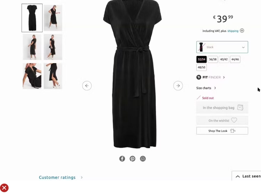
UX Guideline 1. Centralize All Product Images
Issue: Customers often miss out on images displayed in various places on the product page. This can prevent comprehensive product understanding and affect purchasing decisions.
Advice: Centralize all images in the primary image gallery, irrespective of their presence elsewhere on the product page.
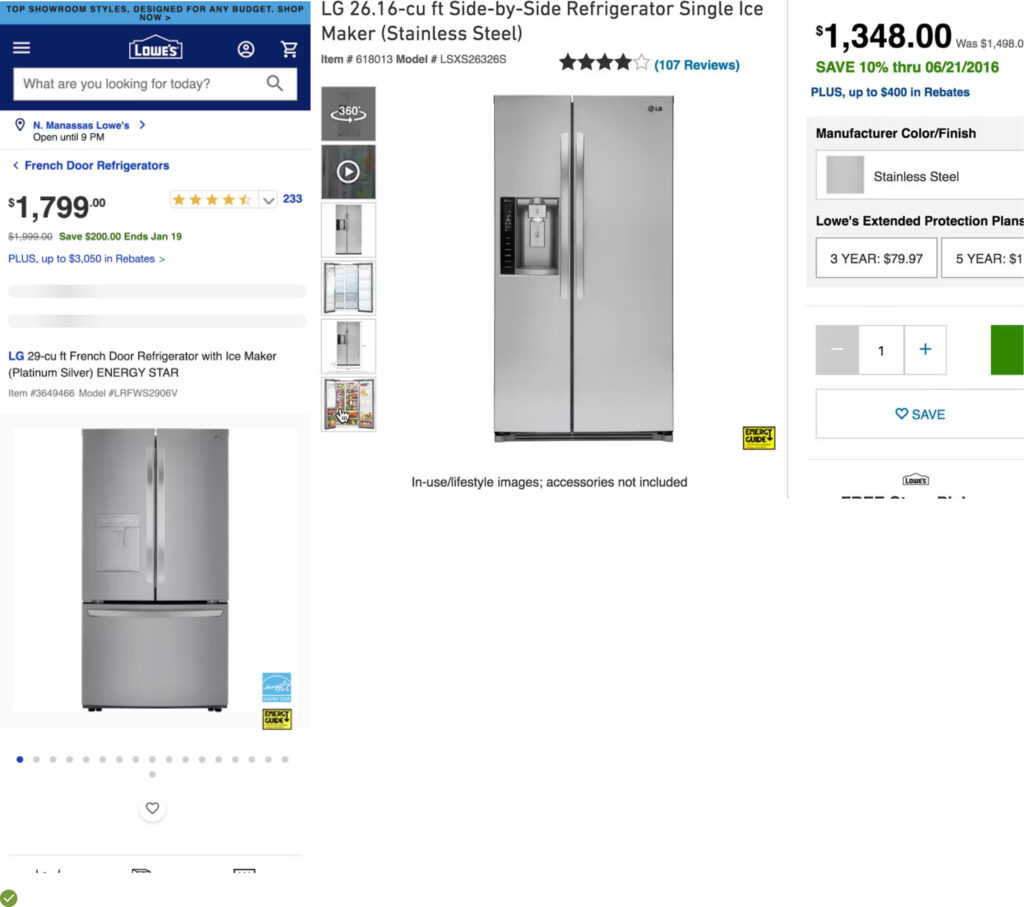
Example: Take Lowe’s, for instance. All product images are available in a single, user-friendly gallery, whether displayed on the product page or via an overlay. It ensures maximum image visibility and facilitates easy product exploration.
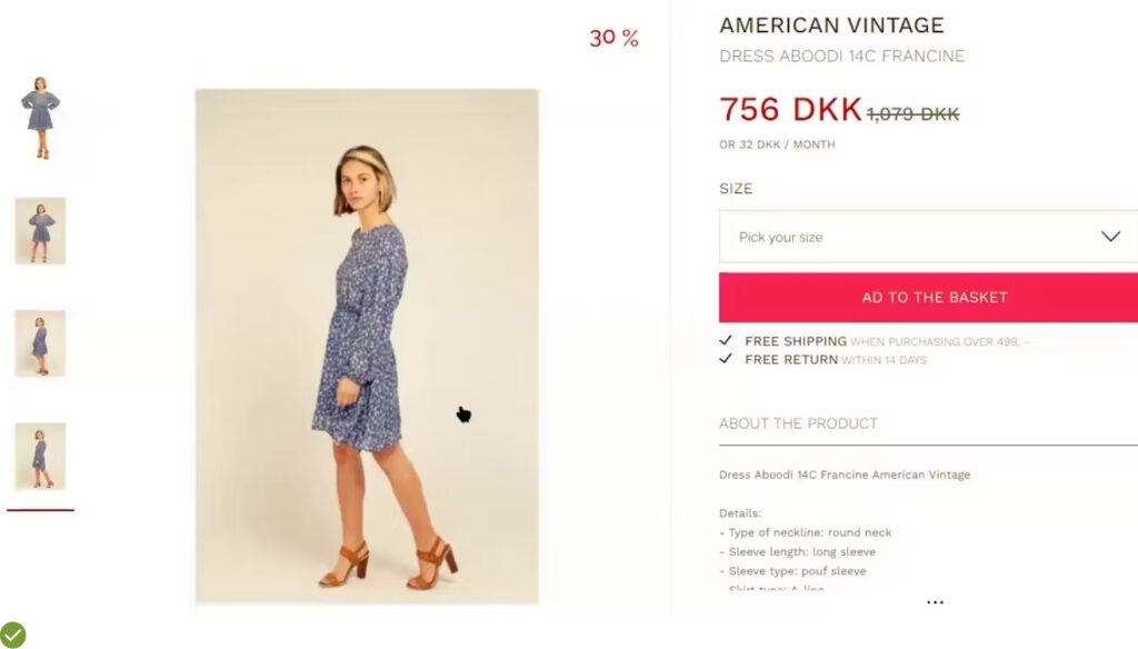
UX Guideline 2. Provide Ample Product Images
Issue: Insufficient product images can hamper customers’ product evaluation process, affecting their purchasing decisions.
Advice: Always provide a minimum of 3-5 images for all products, prioritizing popular and best-selling items for sites with large product catalogs.
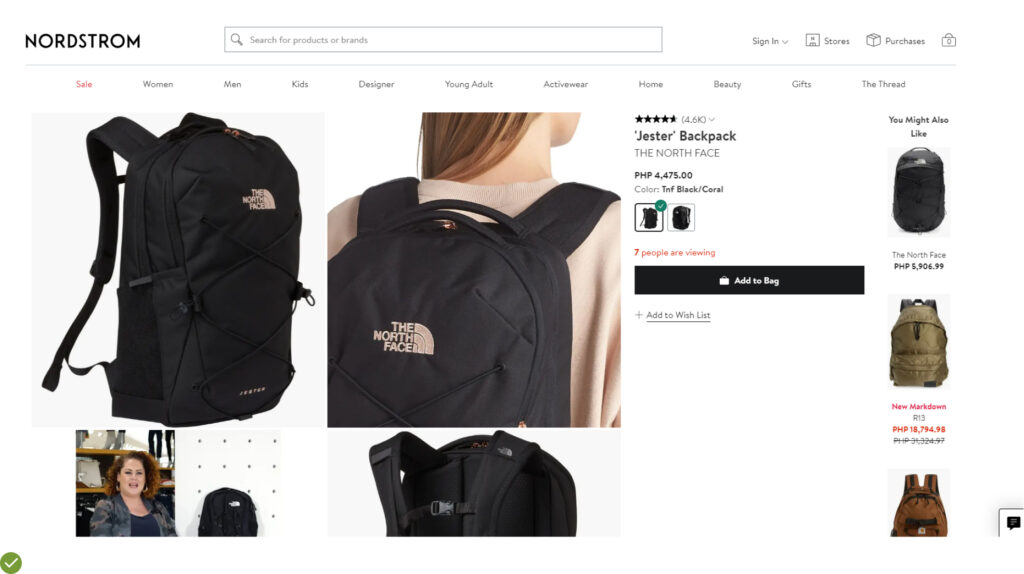
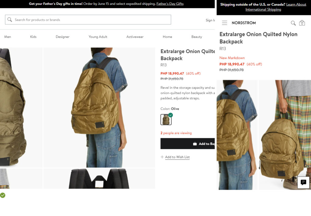
Example: Nordstrom excels in this aspect by providing high-quality, multiple images of a North Face backpack, enhancing product understanding and attracting customer interest.
UX Guideline 3. Showcase Products from Multiple Angles
Issue: Customers need a comprehensive visual representation of a product to make informed purchases. Straight-on product shots often fall short of fulfilling this requirement.
Advice: Ensure the availability of 3-5 images of products, captured from varied angles.
Example: Nordstrom effectively employs this strategy. One of its customers discovered a unique product feature via an angle image showcasing the back of a bag, adding to the product’s appeal.
UX Guideline 4. Employ Thumbnails for Additional Product Images
Issue: Customers often miss out on extra images and lack information when images are signified by indicators or text.
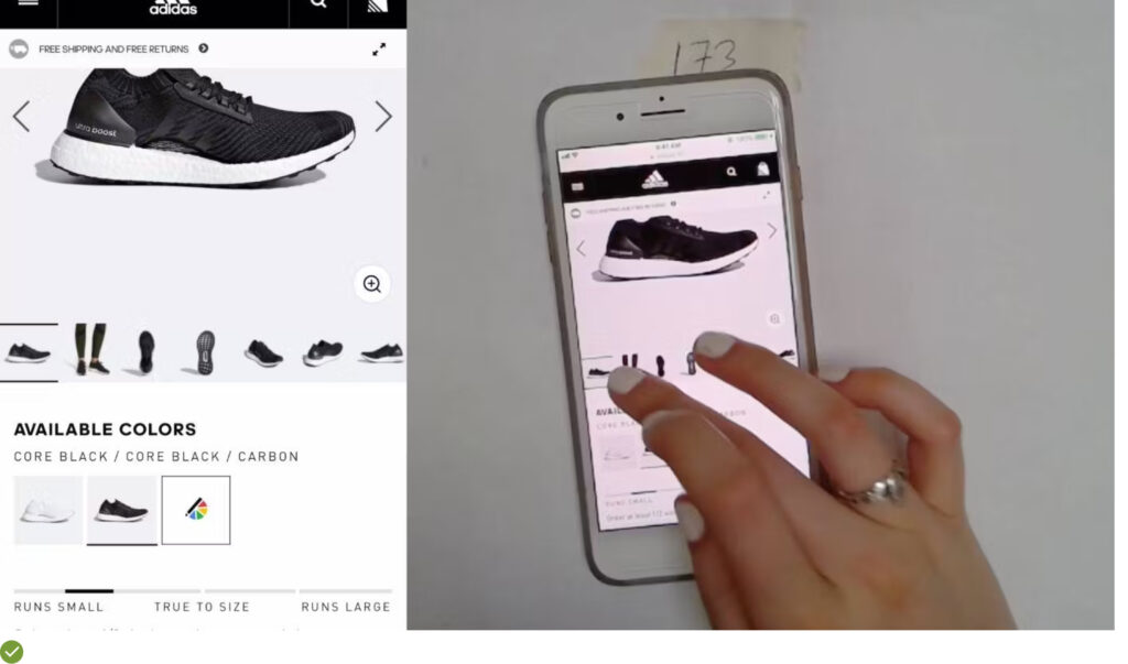
Advice: Always use thumbnails to represent extra product images.
Example: 100% of desktop benchmark sites, like most desktop-friendly ecommerce sites, use thumbnails to indicate additional product images, providing customers with a better understanding of the product.
UX Guideline 5. Utilize Video for Product Display
Issue: Certain essential product features are difficult to communicate using static images alone.
Advice: Incorporate product videos for at least the top-selling items.
Example: Product videos can inspire customers, showcasing the potential uses of the product. These videos can make up for the information gap between online and physical shopping experiences, providing additional visual details that static images can’t capture, thereby enhancing product understanding and appeal.
UX Guideline 6. Be Cautious with Thumbnail Truncation
Issue: Thumbnails truncation often leads users to overlook additional images, limiting their product understanding.
Advice: Display all product thumbnails directly on the product page without truncation or ensure that clicking any thumbnail reveals all images.
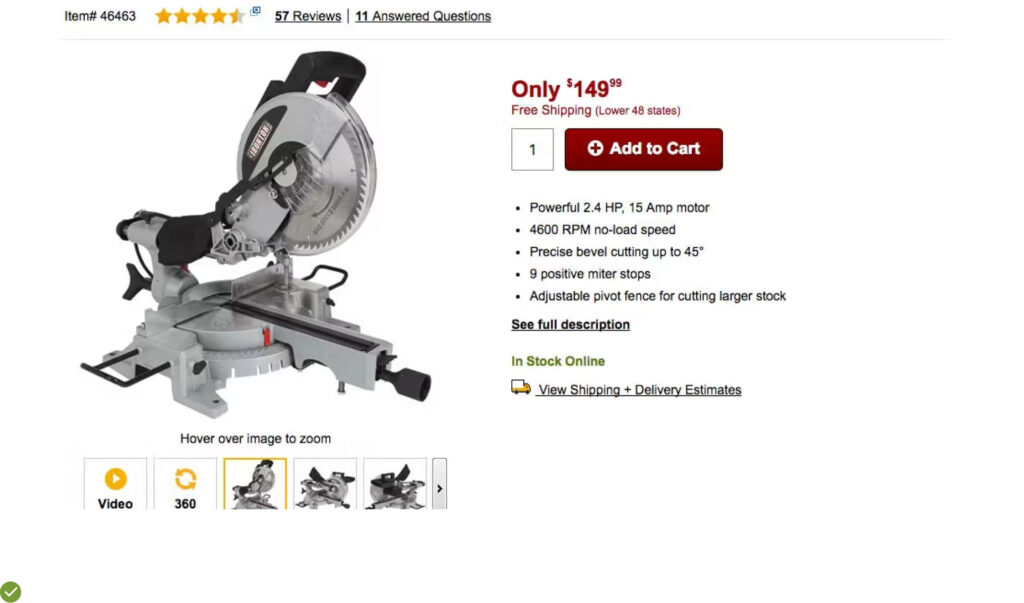
Example: Home Depot has implemented a “Truncation Thumbnail” approach to hint at the existence of more thumbnails, but remember, it must be done carefully to avoid user confusion and missed opportunities.
UX Guideline 7. Enhance Spec Sheet Scannability
Issue: Disorganized and densely packed spec sheets make it challenging for users to locate specific information.
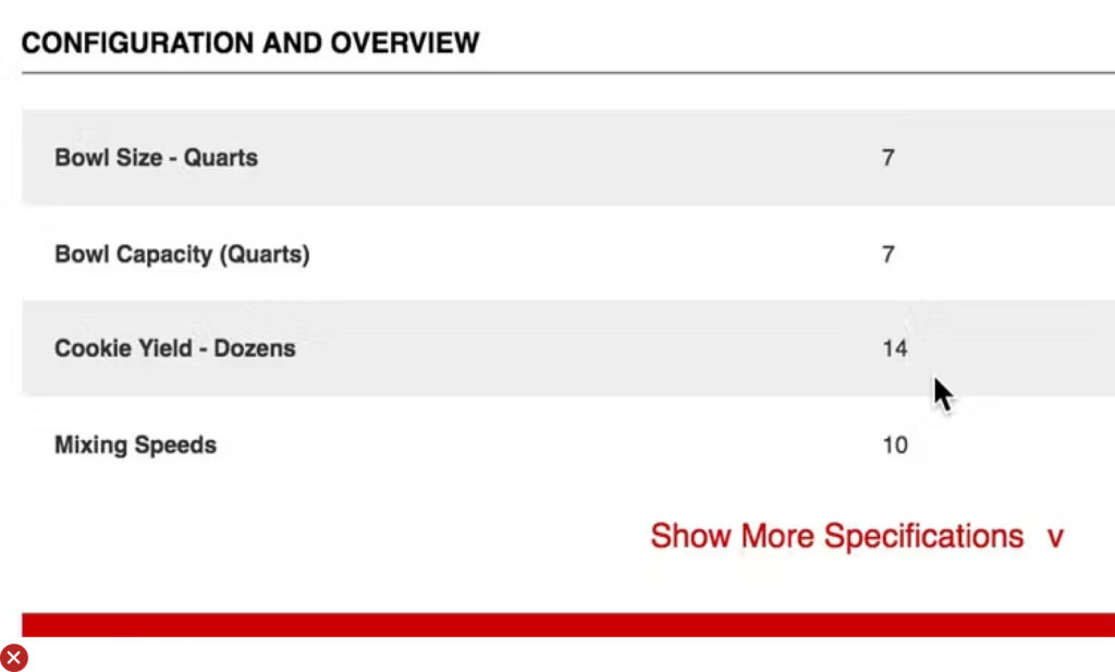
Advice: Structure spec sheets into sections of related information, use clear subheadings, prioritize vital specifications, employ row styling and visual cues for improved readability, and limit the use of multiple columns.
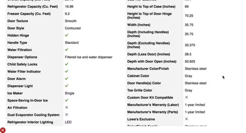
Example: REI uses both vertical and horizontal shading to guide users seamlessly from scanning specification labels to locating their associated values, making information retrieval swift and straightforward.
UX Guideline 8. Repeat Core Product Info
Issue: Customers look for vital product information in both product descriptions and specification sheets. Keeping information exclusive to one area may lead to missed details.
Advice: Include core product features for specification-driven products in both the product description and specification sheet.
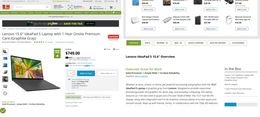
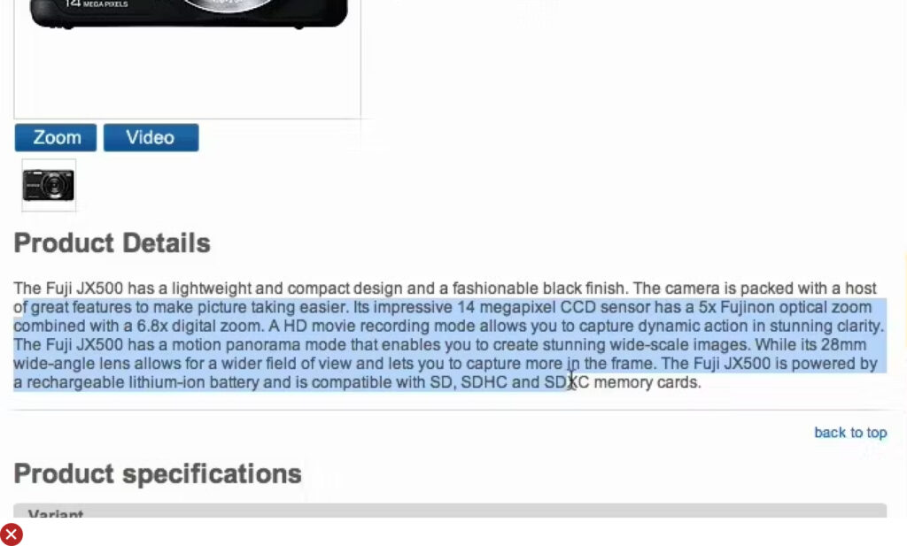
Example: B&H effectively communicates critical details, such as lens mount and compatibility format, in both the description and the specifications, making key information easily accessible, irrespective of the users’ preferred location.
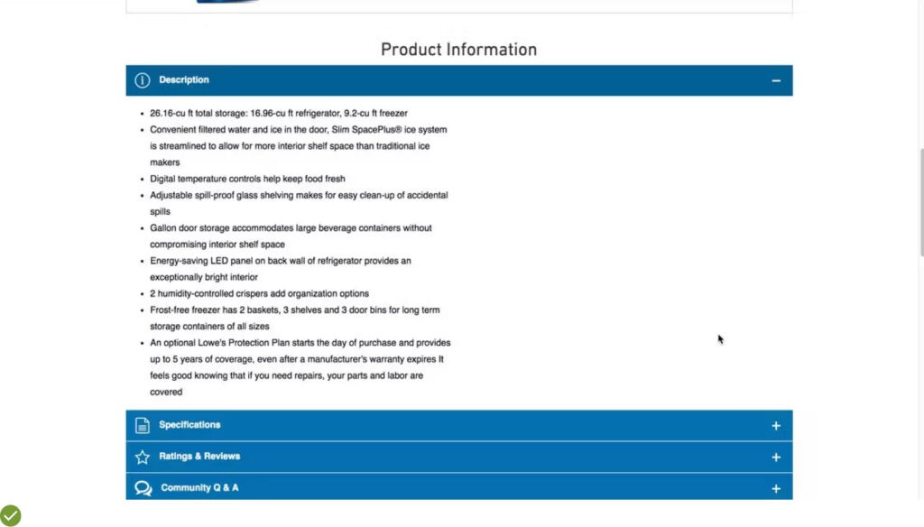
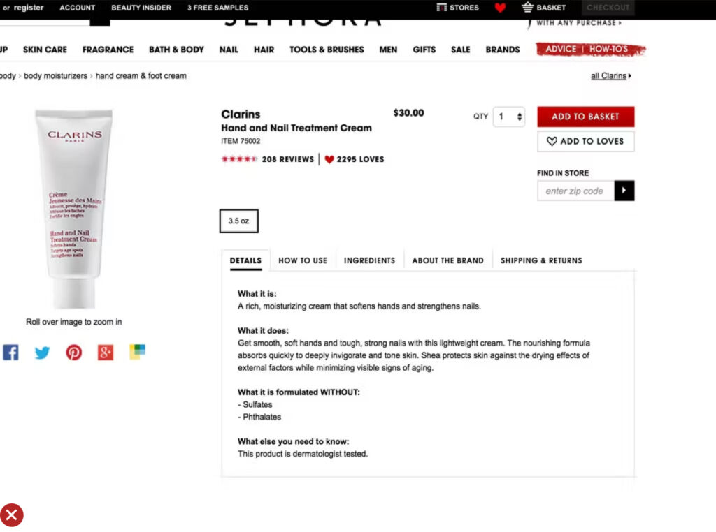
UX Guideline 9. Use Bullet Lists and Text Blocks for Product Descriptions
Issue: User preferences vary for information retrieval based on their purchasing stage and product familiarity, requiring product descriptions to be both scannable and readable.
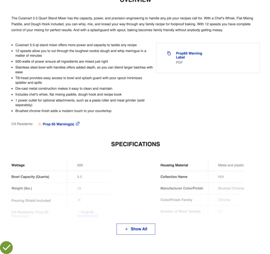
Advice: Use a combination of text blocks (for product overview, potential use cases, and detailed feature explanations) and bullet lists (for product features and specs) in product descriptions. Place them close to each other and ensure core product information is present in both formats.
Example: Lowes provides product descriptions in both bullet and text formats, catering to diverse information-gathering styles, ensuring product understanding is universally accessible.
UX Guideline 10. Reproduce Core Content Across Product Variations
Issue: Users struggle to gather comprehensive information when core product content varies across different product variations.
Advice: Make sure product content like reviews, Q&A, images, videos, manuals, etc. are available across all variations of the same product. If some content applies only to a specific variation, explicitly notify users.
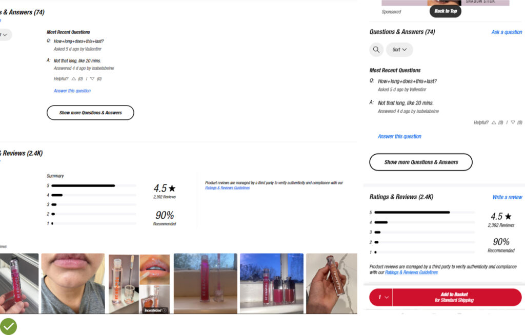
Example: Sephora maintains consistency in reviews and star ratings across all lip gloss variations, indicating proper crosslinking or reproduction, which enhances the user’s product understanding and buying decision.
UX Guideline 11. Standardize Vendor-Supplied Specs
Issue: Inconsistent product information hinders users from directly comparing products in spec sheets.
Advice: Standardize supplier data to ensure specifications are consistently available with uniform labeling, units of measure, measurement resolution, and display sequence.
Example: Home Depot displays product specifications with consistent units, facilitating easy comparison of attributes like product dimensions.
See 4 Research-Backed Tips for Crafting High-Converting Product Descriptions for more information on writing the perfect product description.
UX Guideline 12. Show “Price Per Unit” for Varying Quantity Products
Issue: Products sold in multi-quantity or varying sizes complicate direct price comparison, leading to misinterpretation of relative value.
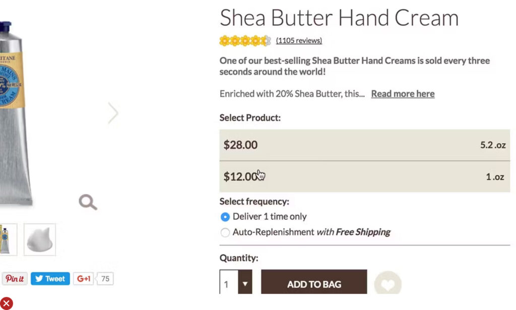
Advice: Display “Price Per Unit” next to the total product price for products sold in varying quantities. Consider “Price Per Serving” for similar products with different dosage suggestions.
Example: Amazon simplifies the comparison of bulk nut prices by indicating the price per pound for the featured product and similar ones from different sellers.
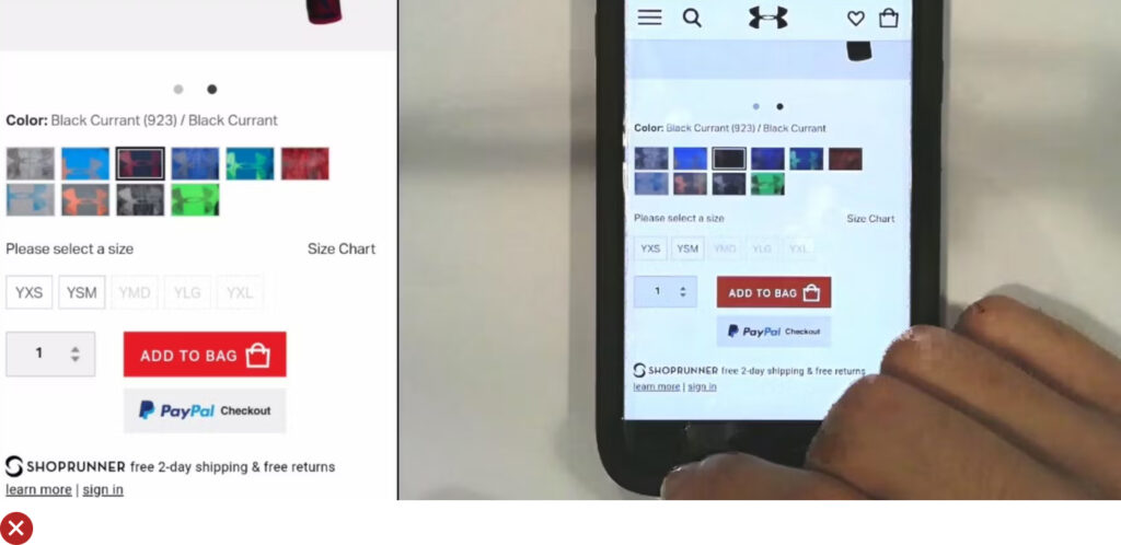
UX Guideline 13. Make the Primary “Add to Cart” Button Distinctive
Issue: Competing call-to-action buttons distract users and complicate the process of adding a product to the cart.
Advice: Give the “Add to Cart” button a unique styling that distinguishes it as the primary page button. Avoid using full-width for sticky “Add to Cart” buttons and surround them with sufficient white space.
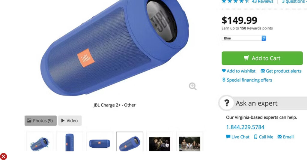
Example: JBL’s sticky “Add to Cart” button is consistently visible, making it easy for users to add products to their cart.
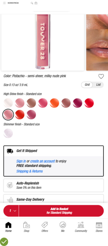
UX Guideline 14. Implement ‘Save’ Features Efficiently
Issue: Users relying on ‘Save’ and ‘Wishlist’ features struggle to save products if the feature requires an account or is hard to access.
Advice: Allow users to save items as “guest users” in ‘Save’ features. Provide clear instructions on how the ‘Save’ feature works and ensure its design and placement are subtle and unobtrusive.
Example: The Urban Outfitters app enables users to save favourites by tapping a small “heart” icon without needing to sign in, streamlining the process of saving items for future review.
UX Guideline 15. Highlight “Free Shipping” Near the “Buy” Section
Issue: Users find “Free Shipping” information valuable but must locate it on the product page to benefit.
Advice: Place “Free Shipping” details in or near the “Buy” section, even if the information is also displayed elsewhere on the site.
Example: Lowe’s strategically places the “Free Delivery” offer near the “Buy” section, ensuring it’s easily spotted when users first land on the product page.
UX Guideline 16. Show or Link the Return Policy from the Main Product Page
Issue: Users need to spend extra time locating the return policy when considering products they are unsure about.
Advice: Make the return policy readily available in the main content of the product page, either through a link or as a product page section.
Example: The Walmart app displays a clear summary of the return policy along with a link to more details, providing comfort to users.
UX Guideline 17. Use “Vertically Collapsed Sections” for All Content Sections
Issue: Long, non-collapsed sections can prevent users from getting an overview of the product page due to each section pushing the next one out of view.
Advice: Implement ‘Vertically Collapsed Sections’ for all content sections on a product page. They should have clear section titles and work as full- or partial-width page sections.
Example: Collapsible sections have been observed to make extensive product page content more digestible for users.
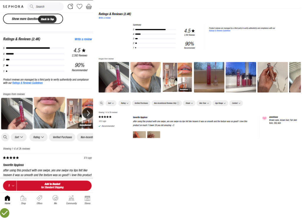
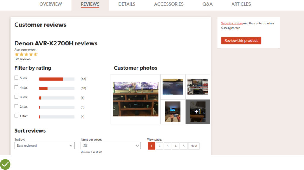
UX Guideline 18. Offer a Ratings Distribution Chart at the Review Section Top
Issue: Reviews presented without overall context can lead users to misinterpret the product’s actual ratings distribution.
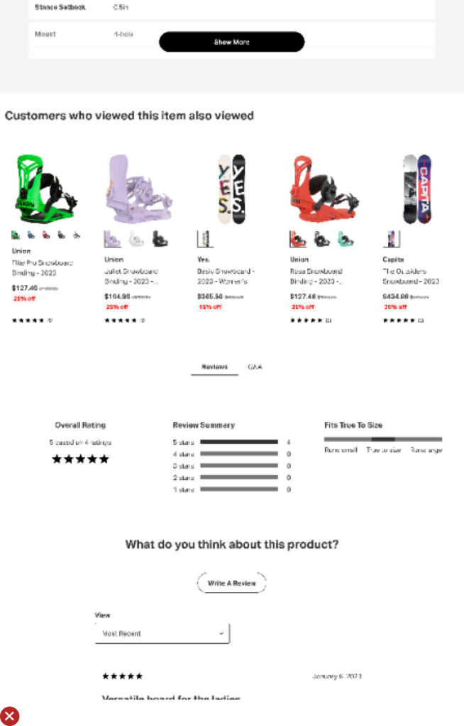
Advice: Always display a visible ratings distribution chart at the top of the “Reviews” section. However, hide it for products with few reviews (e.g., less than five).
Example: Sephora provides an overall average rating and a ratings distribution chart, offering necessary context for users to understand the product rating better.
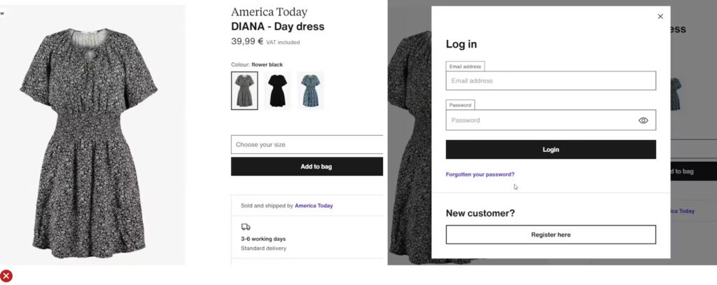
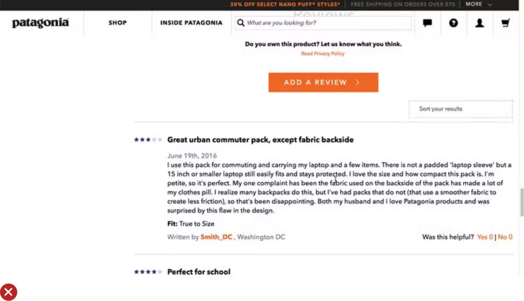
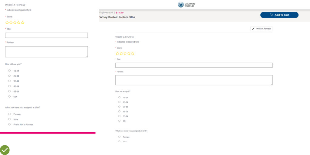
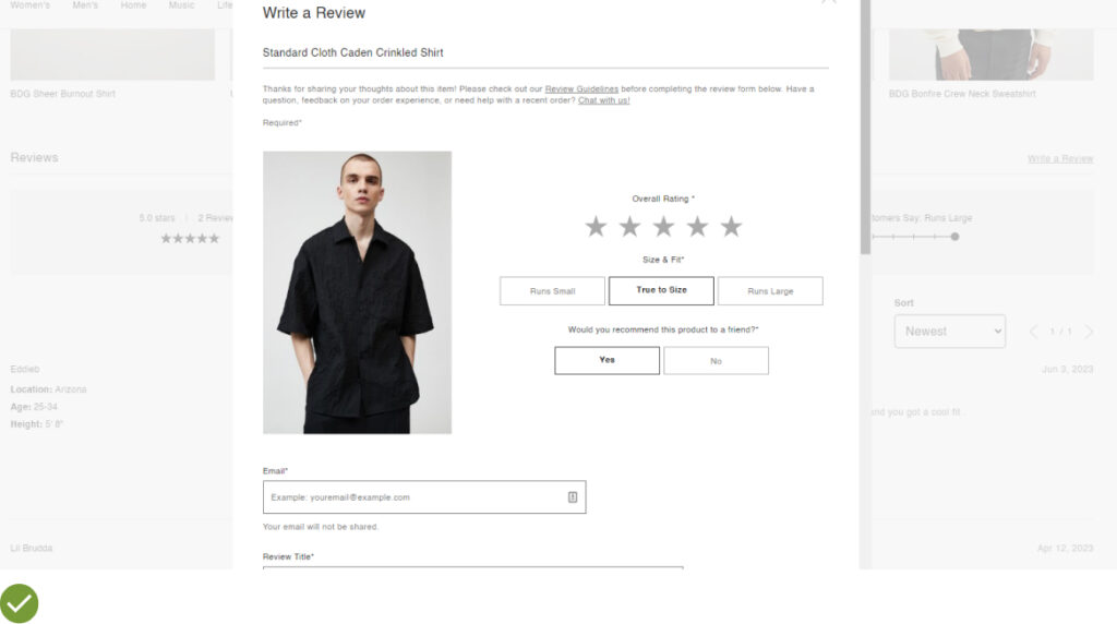
UX Guideline 19. Avoid Account Wall for Submitting Product Reviews
Issue: Too few reviews will restrict users’ ability to find relevant information, identify patterns, and may lead users to question the reviews’ authenticity.
Advice: Avoid requiring an account for submitting product reviews. Simplify the review submission process by only asking for necessary personal information, optimizing form fields, and encouraging or incentivizing users to leave reviews.
Example: World Market does not require an account, only an optional email address for review submission, thereby reducing the friction in the review process.
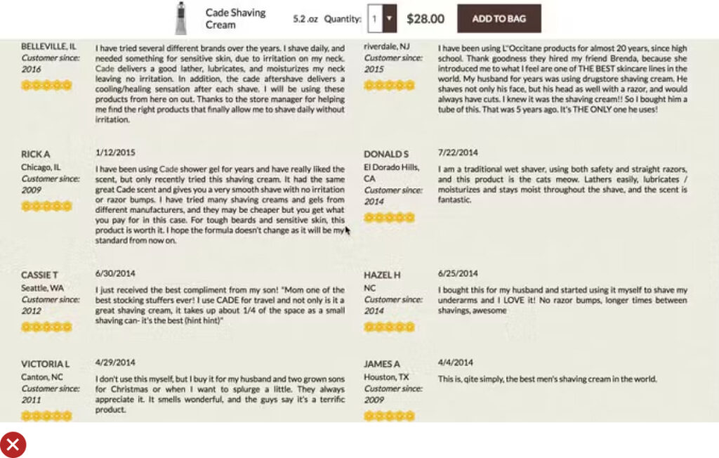
UX Guideline 20. Use ‘Relevance’ as the Default Review Sorting
Issue: Users who read the first few reviews can be discouraged from purchasing the product if the reviews seem artificially positive, overly negative, or unhelpful.
Advice: The default sorting of reviews should be based on diversity and relevance. Consider factors like both positive and critical reviews, the review’s helpfulness, length, date, user-uploaded images, and verified purchases.
Example: Joann’s default reviews sort is “Most Relevant,” defined using a tooltip that considers helpfulness votes, recency, pictures, and other traits.
UX Guideline 21. Present a Clickable Ratings Average at the Product Page Top
Issue: Reviews, which are critical to users, are often located far down the product page.
Advice: Place a clickable ratings average at the top of the product page, linking to the reviews section.
Example: Crutchfield’s design allows users to immediately locate review information without much effort.
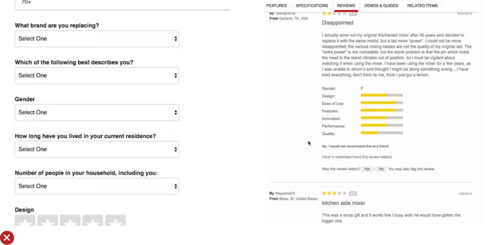
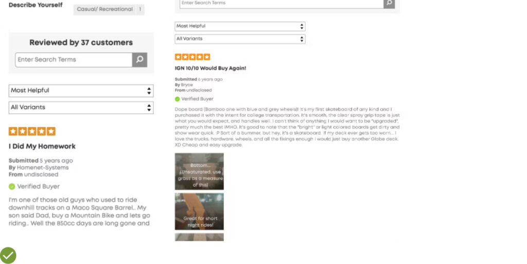
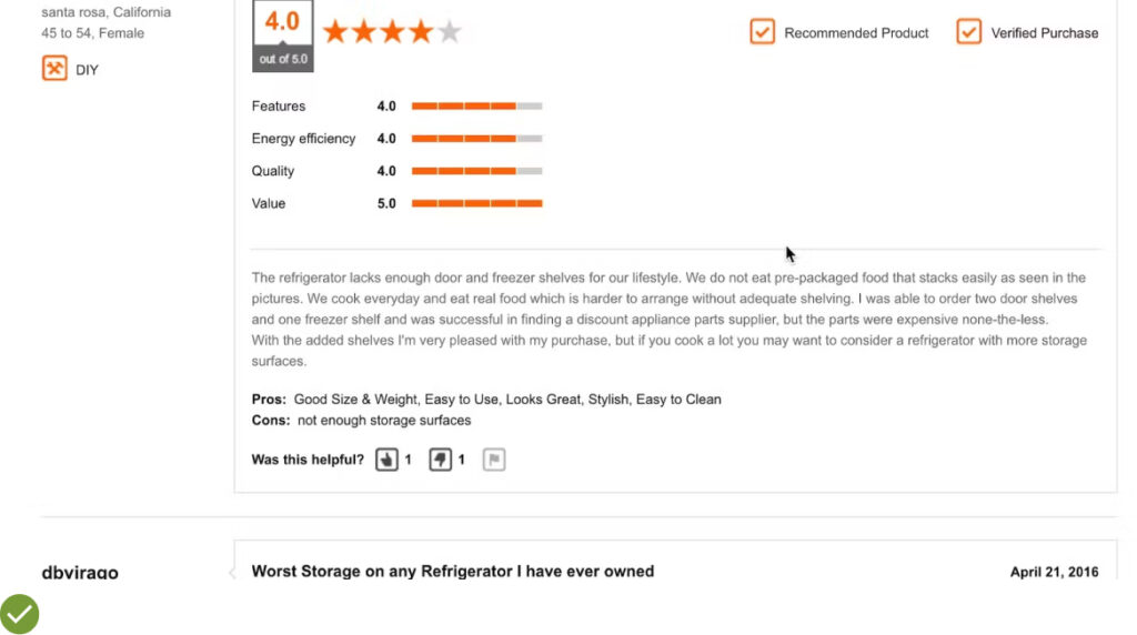
UX Guideline 22. Request Only Highly Relevant Personal Info in Review Submission Forms
Issue: Reviewers are often hesitant to share personal information, and some users find it hard to relate reviews to their needs.
Advice: Ask reviewers for basic, contextually relevant info based on the product being reviewed. Avoid asking for irrelevant surveys or marketing information. If personal information is required, consider making it optional and provide an explanation of its usage.
Example: Users appreciate seeing relevant information about the reviewer, such as age, height, and size, as it helps them find reviewers similar to them.
UX Guideline 23. Do Not Use Non-User-Initiated Feedback Requests
Issue: Feedback requests interrupt the product-browsing experience and can impact users’ overall site perception.
Advice: Avoid site-initiated requests for feedback. If necessary, display static feedback requests in less noticeable areas of the site. Also, encourage feedback, auto-remove feedback requests after a response goal is met, and consider using them only on desktop sites.
Example: Adidas requests surveys only after users have completed their order, on the confirmation page.
UX Guideline 24. Respond to Negative User Reviews
Issue: Negative reviews can negatively impact users’ opinion of both the product and the entire site.
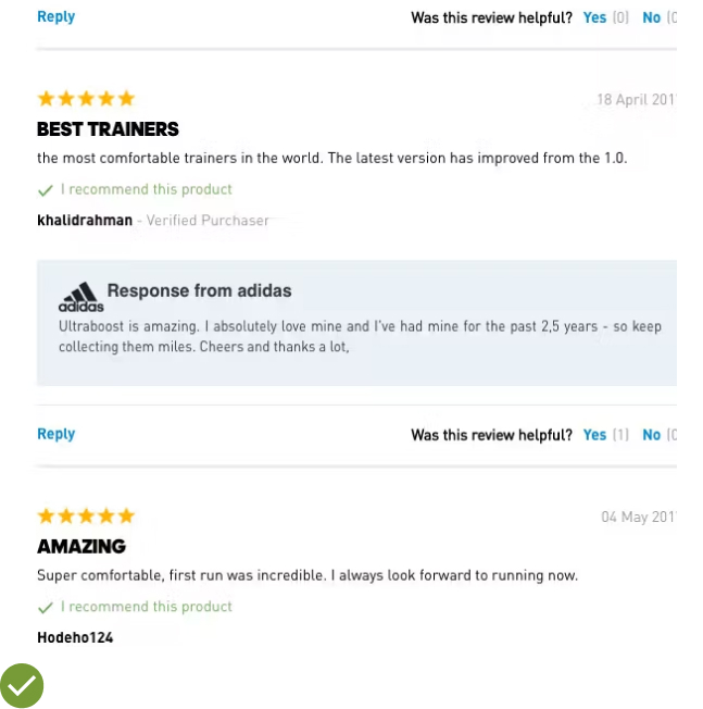
Advice: Respond to negative user reviews, directly addressing the issues raised. Ensure responses reiterate the issue, detail feedback usage, and provide contact information. The responses should be visually distinct from the user reviews.
Example: Responding to negative reviews can boost site trust, keeping users on the site even if they decide to look for alternative products.
UX Guideline 25. Position Full-Width Cross-Sell Sections Last on the Product Page
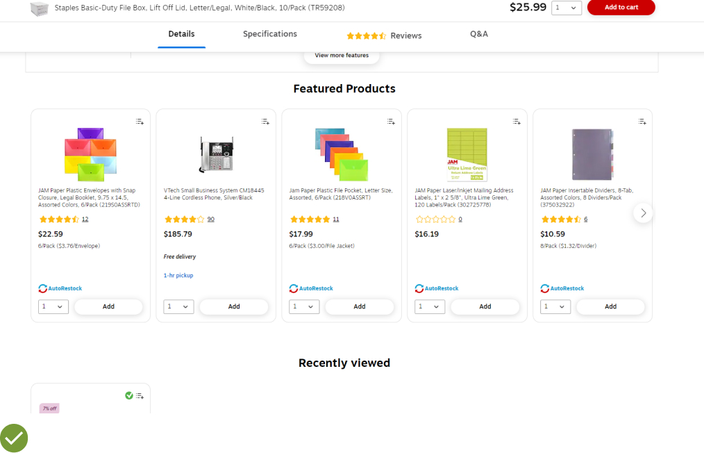
Issue: Full-width cross-sell sections can make users stop scrolling, thinking they have reached the end of the product details page, and potentially miss important content.
Advice: Place full-width cross-sell sections as the last section on the product details page.
Example: On Staples’ site, a user viewed the “Customers Also Viewed” carousel of cross-sells at the bottom of a product details page after discarding a current product. Placing cross-sells at the
bottom allows users to focus on the current product without distractions.
UX Guideline 26. Provide a Cross-Sell Section Solely For Supplementary Products
Issue: Users often find it hard to locate supplementary products for the item they’re viewing.
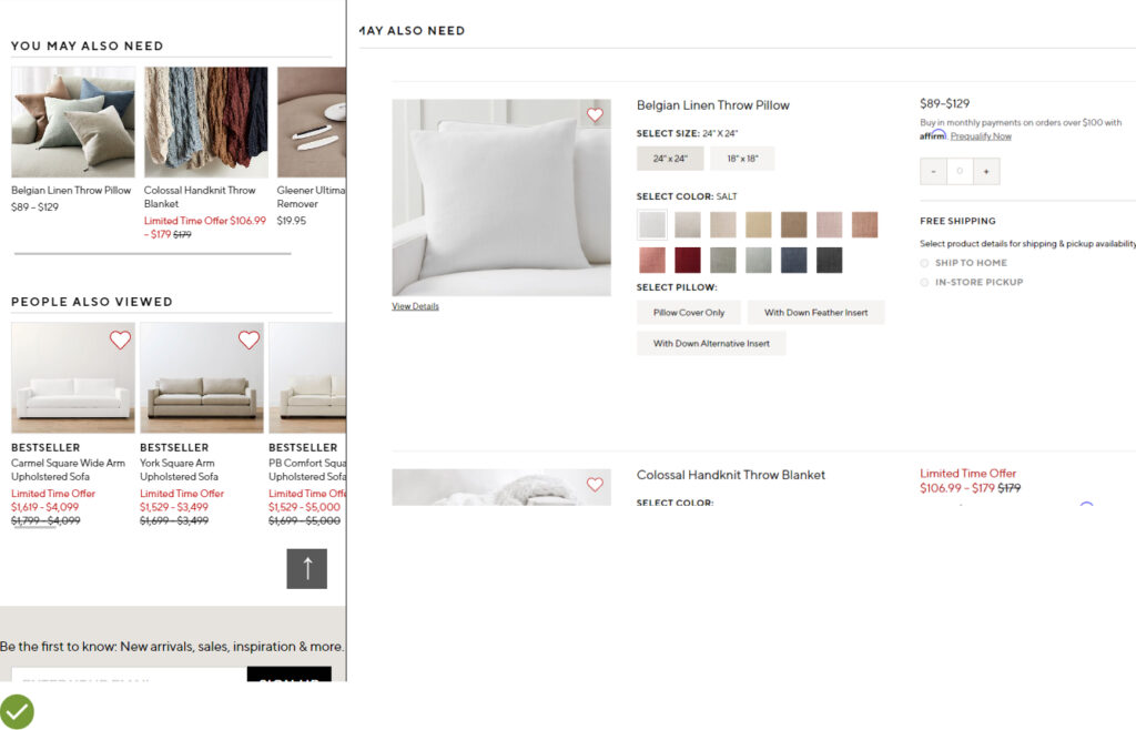
Advice: Create at least one separate cross-sell section specifically recommending supplementary products.
Example: Pottery Barn has a supplementary products section titled “You May Also Need” and also offers an instructional video on “How to Hang a Drape”. This aids users in ensuring they have all the necessary items when their drapes are delivered.
UX Guideline 27. Suggest Alternatives for Discontinued Products
Issue: If a desired product is unavailable, users may leave the site if they can’t easily find an appropriate alternative.
Advice: When a product is permanently unavailable, clearly state it using “Discontinued” terminology and aggressively promote alternative products.
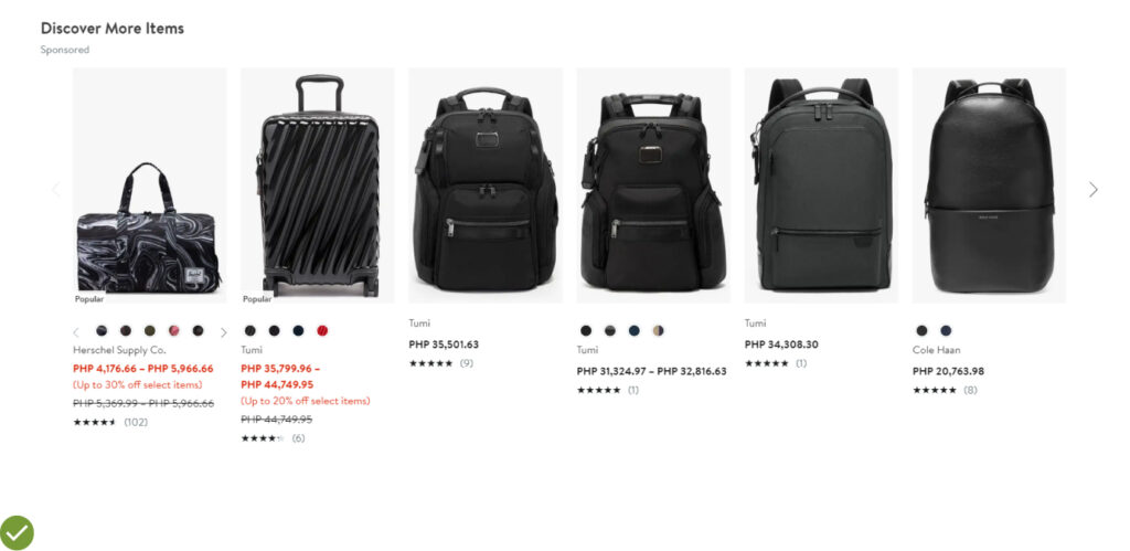
Example: On Nordstrom’s site, when a backpack was unavailable, alternative products were prominently displayed above the unavailable product, focusing users’ attention on examining the alternatives first.
Outperform 99% of Online Stores with Product Page UX
We’ve journeyed through the essence of your product page UX, highlighting the immense importance it carries in the conversion process.
With the guidelines we’ve outlined, your product page can now outperform 99% of the online stores out there.
The changes you implement based on these guidelines could lead to an exciting rise in ‘Sessions with Add to Cart’, a key indicator of the impact of your UX changes.
We’ve armed you with the knowledge to turn your product page into a world-class platform, ensuring all customer questions are answered satisfactorily, instilling trust, and ultimately leading them to complete their purchase eagerly.
Don’t forget the impact of UX enhancements should be continuously monitored for progress.
So, embrace the Product Page UX theme and set your WooCommerce store on the path to unprecedented success.

